

1 minute
From outdated to trust-building online store

Ludmilla Ramos
|
Web Designer
Project Overview
Before the redesign, Moka Sant’s website looked dated, lacked credibility, and didn’t reflect the craftsmanship of its products. After rethinking the brand identity, structure, and visuals, the site became a polished showcase that impressed visitors, built trust, and supported off-site sales through a professional, user-friendly experience.


Ragatex
|
2018
Impact
→ Full rebrand to increase trust
Developed a distinctive visual identity, colour palette, logo, and brand tone to position a centuries-old shoemaker as a premium, credible e-commerce brand.
→ Structured for easy product discovery
Created sitemap, mega-menu navigation, and product category hierarchy to streamline browsing and highlight hero products.
→ Compliant and ready for European markets
Designed and implemented GDPR-compliant pages and policies, ensuring legal transparency and building user confidence.
→ Optimised template for brand and market fit
Selected and customised a Prestashop theme to maximise visual appeal, product focus, and scalability for resale via flash sales platforms.
→ Replicable framework for multiple brands
Store structure, category taxonomy, and content strategy were later adapted to other brand projects, reducing setup and workload.
Problem-Solving
A store no one would trust with their credit card
When I joined the project, Moka Sant’s online store was in bad shape. It didn’t reflect the quality of the shoes, and it failed to connect with its style-conscious European audience. The brand felt outdated, navigation was clunky, and there were no trust signals or legal compliance in place.
Key Problems:
Online Store not ready to sell: Purchases happened off-site on flash sales platforms, so the website had to sell the brand, not the product directly.
Poor visuals and experience, no trust: The experience wasn’t optimised for discovery or for gathering user insights to guide future decisions.
Goals
Trust first, sales second
The goal was to turn Moka Sant’s site into a premium brand, the one that made visitors think “this brand is the real deal” before clicking through to buy elsewhere. This model should be the base to replicate to other brands created on redesigned from the same company.
Strategic vision:
Elevate the brand’s look and feel to match its craftsmanship.
Make it competitive with other high-quality footwear sites.
Build a scalable framework that could be reused for 4–5 other brands.
Challenges & Constraints
Tight scope, big ambitions: The situation was a bit like designing a luxury store inside a rented shopfront.
Locked into PrestaShop structure: improvements had to happen within the limits of a chosen template.
No in-house dev team: every solution had to be efficient and budget-friendly.
Minimal user data: we relied on competitive benchmarking and a proto-persona to guide design.
Replicability requirement: the approach had to work again, fast, for multiple brands with the same structure.
The Process
From market scan to brand glow-up
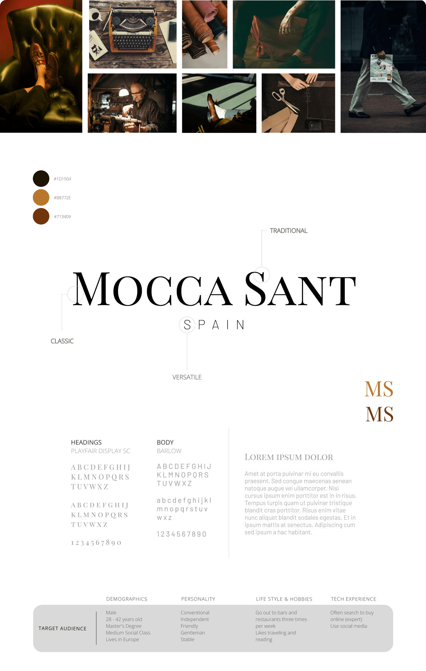
Reviewing competitor websites for colour palettes, typography, and overall brand and web design styles, gave me a feel for how the high-end players presented themselves and where Moka Sant could position itself and stand out.
Alongside this, I spoke with the team to understand their customers’ preferences and values. From these meetings, I created a proto-persona — a profile of our ideal customer — to guide branding and design decisions toward a more polished, credible, and competitive look.

Shaping the brand’s new look
So, it became clear how the company envisioned its place in the market — even if the approach leaned more on marketing goals than user-centred research.
This perspective shaped the foundation of the visual identity: an elegant, modern-yet-traditional style that echoed the craftsmanship of the shoes while signalling credibility and premium quality. The goal was to balance heritage with a contemporary appeal that would feel at home in the luxury segment.
A vision came to life
The customer journey was crucial — not just for design direction, but as a clear blueprint to show the CEO, e-commerce team, and IT managers exactly where the website fit into the bigger picture. It helped us understand what users would likely prioritise when landing on the site, and how to design for that purpose.
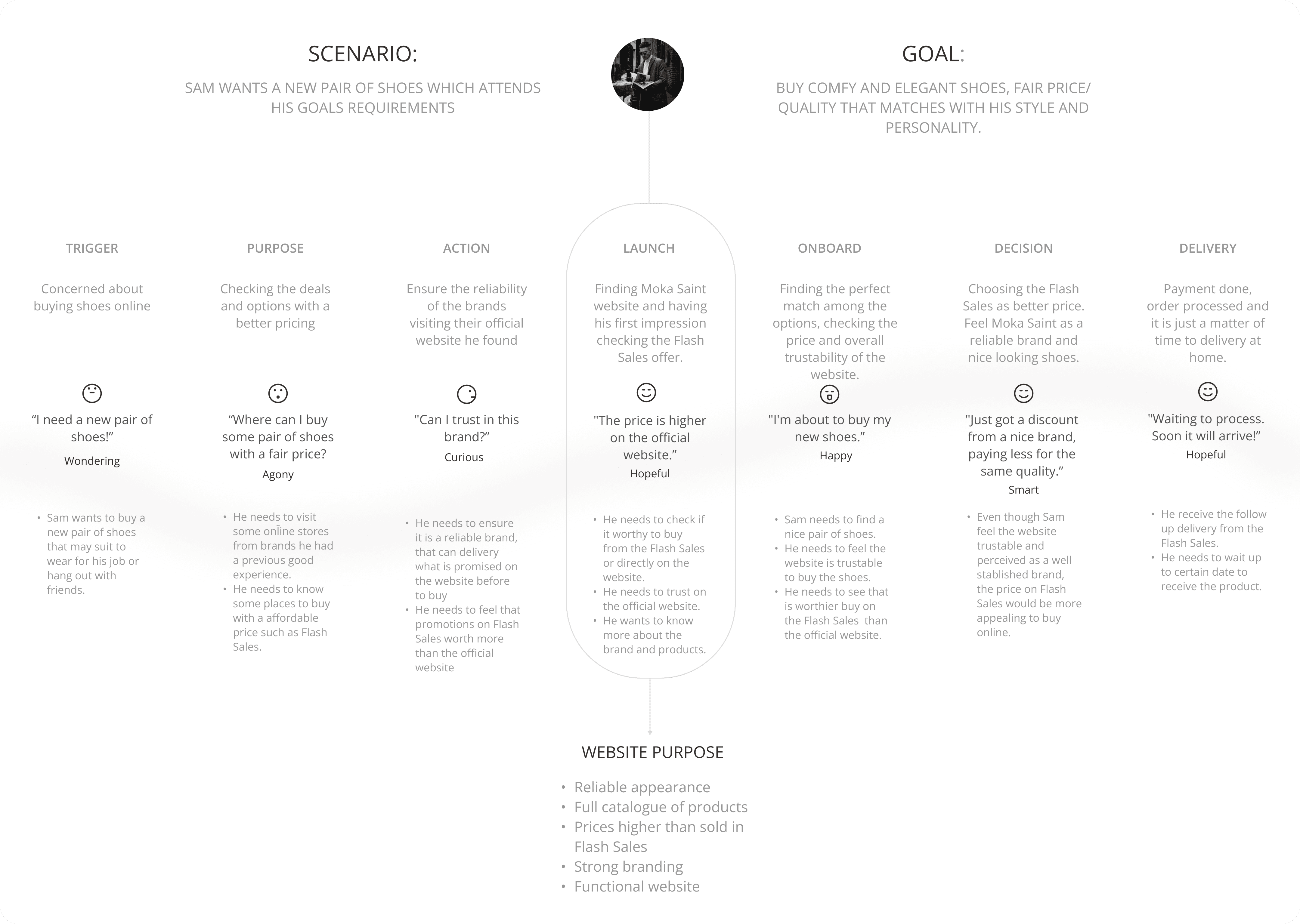
With no research budget (and AI still just a buzzword back then), I relied entirely on UX best practices to create a functional, seamless sitemap.
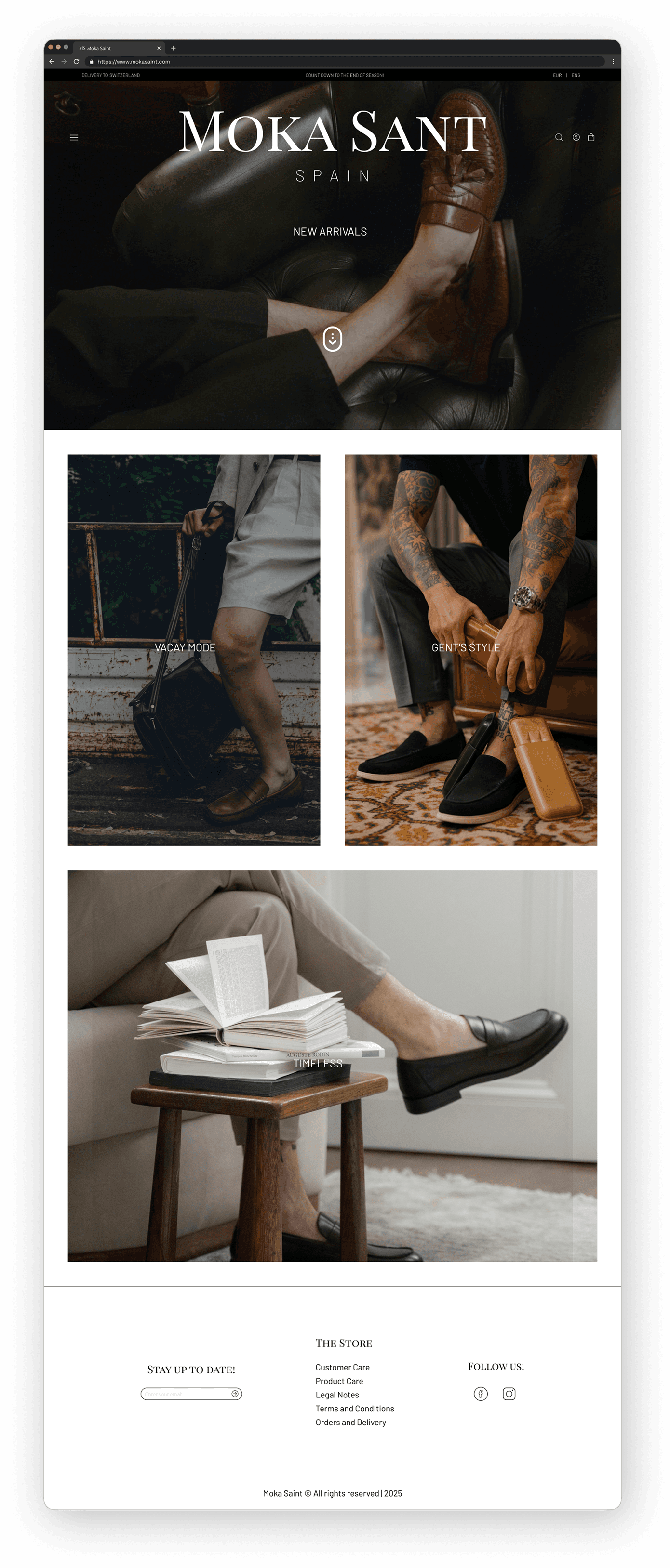
From there, the concept was straightforward: visuals first, products second.
The goal was to impress at first glance and earn trust through aesthetics and usability.
That meant high-quality imagery, elegant navigation, payment acceptance flags, GDPR compliance (terms, privacy policy, cookies banner), and an overall professional look.
Note: This is a redesign of the previous website, as the company made changes and it is currently not working.
I selected a flexible Prestashop theme that could be adapted for other brand sites without looking identical, while keeping the same core principles: visual impact and trust as the main drivers.
Looking back, starting forward
This project wasn’t glamorous — the website existed more as a trust anchor than a true sales channel — but it was the first time I truly connected branding, design, and marketing into one experience, as an intern responsible for end-to-end websites as a marketer professional. Working within a bunch of tight constraints, I learned that a website is never “just a template.” It’s a system that requires strategy, structure, and a user perspective to meet user needs and business goals. Today, I see the several flaws in that early work, but also recognise it as the moment I stopped treating design as a hobby and began building my career for real.
What I would do differently, in the same scenario that could be within my scope:
Advocate for explicit analytics from the flash sales companies: they could provide essential information regarding customer behaviour and general data that would lead me to create a real persona and prioritise products, leading to better design strategies of a online store.
Advocate for proper marketing strategies: allocate budget to create and execute a GTM Plan in parallel with Flash Sales campaigns to optimise results, create marketing mix strategies to create honest campaigns and build awareness, attracting and engaging real clients.
Advocate for monitoring data after website launching: creating the iteration culture for constant improvements on their online stores aligned with real user feedback.
Advocate for authenticity and hiring a proper team: collaborate with a multidisciplinary team would create a more robust sustainable website faster and unique, with more designers, developers and marketing professionals.
Advocate for research, even when I worked designing front-store in market places: it could be helpful to understand design and copy flaws to improve performance, increase potential of purchases, and clearly see the impact of ROI in the long-run.

