

2.5 minutes
Designing and leading a multilingual, mobile-first wedding website

Ludmilla Ramos
|
Product Design & Manager
Project Overview
At the time, no platform could truly meet the needs of an international, multicultural, multilingual guest list — most lacked proper language support, flexible registries, and automated RSVP flows.
I led and designed a mobile-first MVP website from scratch, collaborating with two volunteer developers and choosing a UI kit that cut their workload by at least 34%. In collaboration with these developers, we launched a responsive, four-language website with streamlined RSVPs and a commission-free, multi-currency registry — all delivered on time, despite tight resources.


Wedding Website
|
2023
Impact
→ Responsive, accessible, culturally tailored UI
Designed a responsive, mobile-first interface prioritising the thumb zone, clear navigation, and manual translations for better cultural fit — improving adoption across diverse user groups.
→ Optimised guest journey
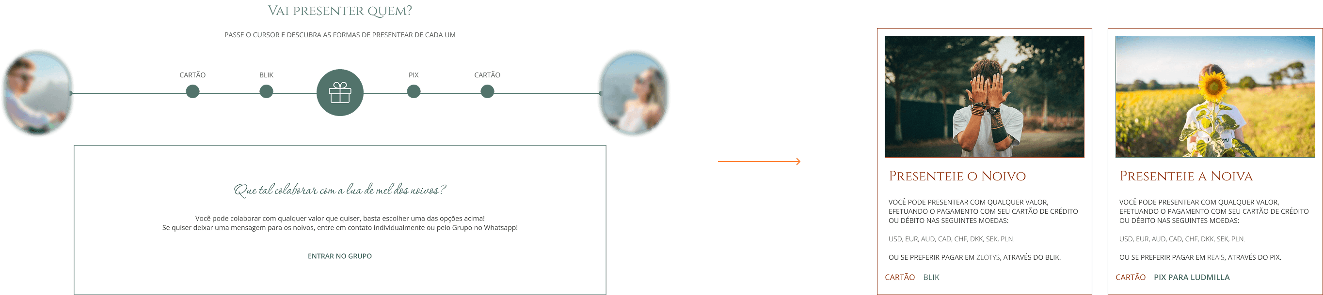
Mapped the end-to-end guest experience and built an information system using APIs for automated RSVPs and a commission-free, multi-currency cash registry.
→ Efficient cross-functional leadership and delivery
Built the site with a UI kit and reusable components, cutting developer workload by at least 34% and enabling on-time delivery despite only ~260–300 combined volunteer hours.
Problem-Solving
In a world where 88% of expats move for love, 57% of them are in intercultural relationships, and 22% are with someone from another country, I was shocked that I couldn’t find a single wedding website builder that ticked all the boxes for couples like us.
Key Problems
No real multi-language support — especially for less common languages like Polish.
Gift registries with high fees that ate into contributions.
No multi-currency support, making it harder for international guests to give gifts.
Poor customisation for destination weddings, leaving no easy way to share travel tips, hotel codes, or local attractions.
Goals
Easing event management for hosts,
making it enjoyable for guests.
The goal was simple but ambitious: create a website to be the core of a communication system, a responsive platform where every guest — anywhere in the world — could access information about the trip and wedding, confirm attandance and receive e-mails with further information over the time, and give gifts safely to the hosts.
Challenges & Constraints
Tight timeline: Six-month delivery window, with immovable deadlines tied to event invitations.
Limited resources: Small budget and minimal operational support.
Reduced development capacity: Volunteer development team of two (one senior, one junior), each contributing roughly five hours per week.
Product vision and strategy: Required adaptive planning, prioritisation, and continuous alignment with the team to maintain progress.
Implementation complexity: Ongoing adjustments during development due to constraints in time, capacity, responsivity and technical trade-offs.
End-to-end ownership: First project fully led independently, covering product vision and strategy, design, delivery coordination, and stakeholder alignment.
Multi responsibility: Wear many hats, acted as Product Designer and Product Manager, independently, leading discovery, design decisions, and leading implementation oversight.
The Process
1. Finding the “perfect” wedding website builder — spoiler: it didn’t exist!
I started by looking for a platform that could keep the same URL and layout while serving content in Portuguese, Polish, and English. I signed up for several popular builders, tested their free plans, and quickly realised most came with frustrating trade-offs — from limited design control to taking a cut of your gift registry.
So, I ran a competitive comparison across 6 dimensions to see which (if any) could deliver:
Language – Can it support all the languages I need, and let me manually translate for a better cultural fit?
Registry – What’s the cost? Are gifts flexible or locked to fixed amounts?
Guest Management – Can it handle RSVPs with automated confirmations and mailing list integrations?
Travel Setup – Is there space to easily share travel tips, hotel codes, and other must-knows?
Communication – Can guests find and share info quickly, or connect with hosts easily?
Design & Customisation – Can I tailor the look, layout, and pages to match the wedding’s visual identity?
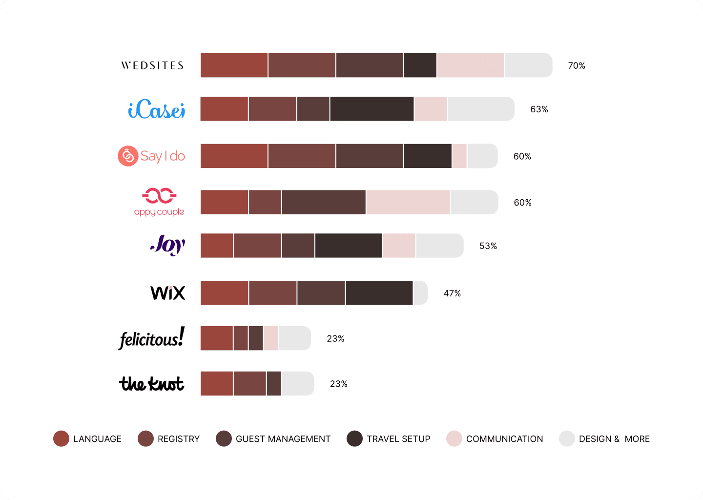
What have I got? No platform scored high enough to meet all needs — so I decided to build my own.
Investigating the idea with real guests and cultural reality checks
Before jumping into design, I floated the idea of a digital invitation and website to a few guests (sample).
The reactions:
Brazilians were all in — they’re used to online RSVPs and digital event hubs.
Polish guests, on the other hand, were less familiar with it, preferring paper invites and personal follow-ups. That insight pushed me to dig deeper into the cultural, language, and usability challenges ahead in secondary research.
Guests weren’t just a single audience, they came from different age groups and cultural backgrounds, each with unique pain points, needs, and motivations and fears. So, I created separate personas to reflect these differences and mapped out their journeys more precisely. The result was a clearer picture of behaviours and expectations, making it easier to design an experience that truly fit each type of guest.
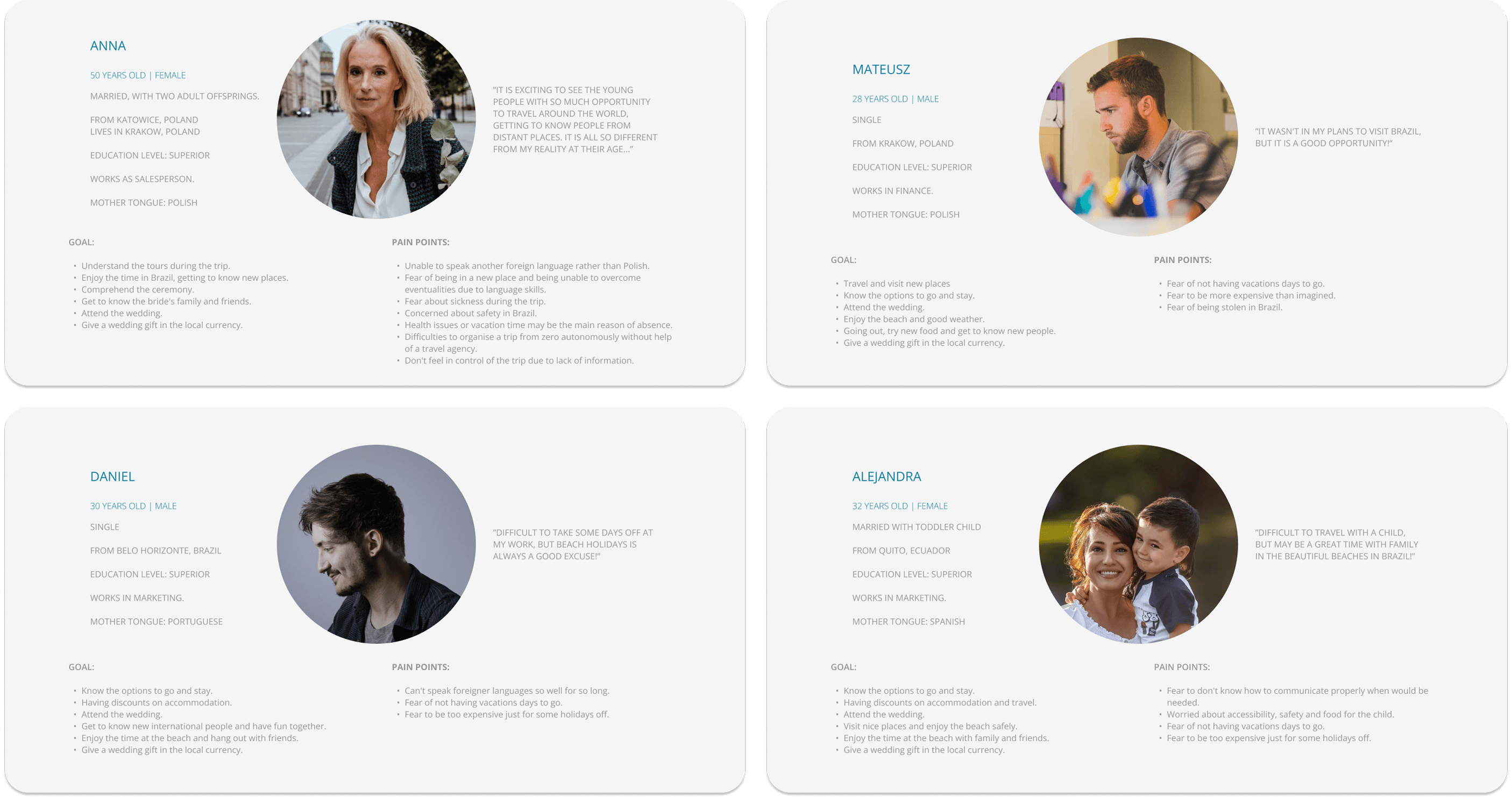
Here’s what stood out based on secondary research and user feedback:
Product adoption – Online RSVPs are rare in Poland, and digital adoption scores are among the lowest in Europe. Some guests might need extra hand-holding to get on board.
Updates & reminders – Brazilians thrive on Instagram and WhatsApp, while Polish guests are more likely to use Facebook Messenger. Any communication plan had to reflect both habits.
Language options – Automatic translation wasn’t going to cut it. Brazilians needed Portuguese, and older Polish guests needed Polish, even if most spoke English.
Gift-giving – In a destination wedding, cash gifts make the most sense. Multi-currency, commission-free options were essential to make giving easy for guests and cost-free for the hosts.
These early conversations and research gave me the green light — and the roadmap — to design something culturally aware, guest-friendly, and genuinely useful.
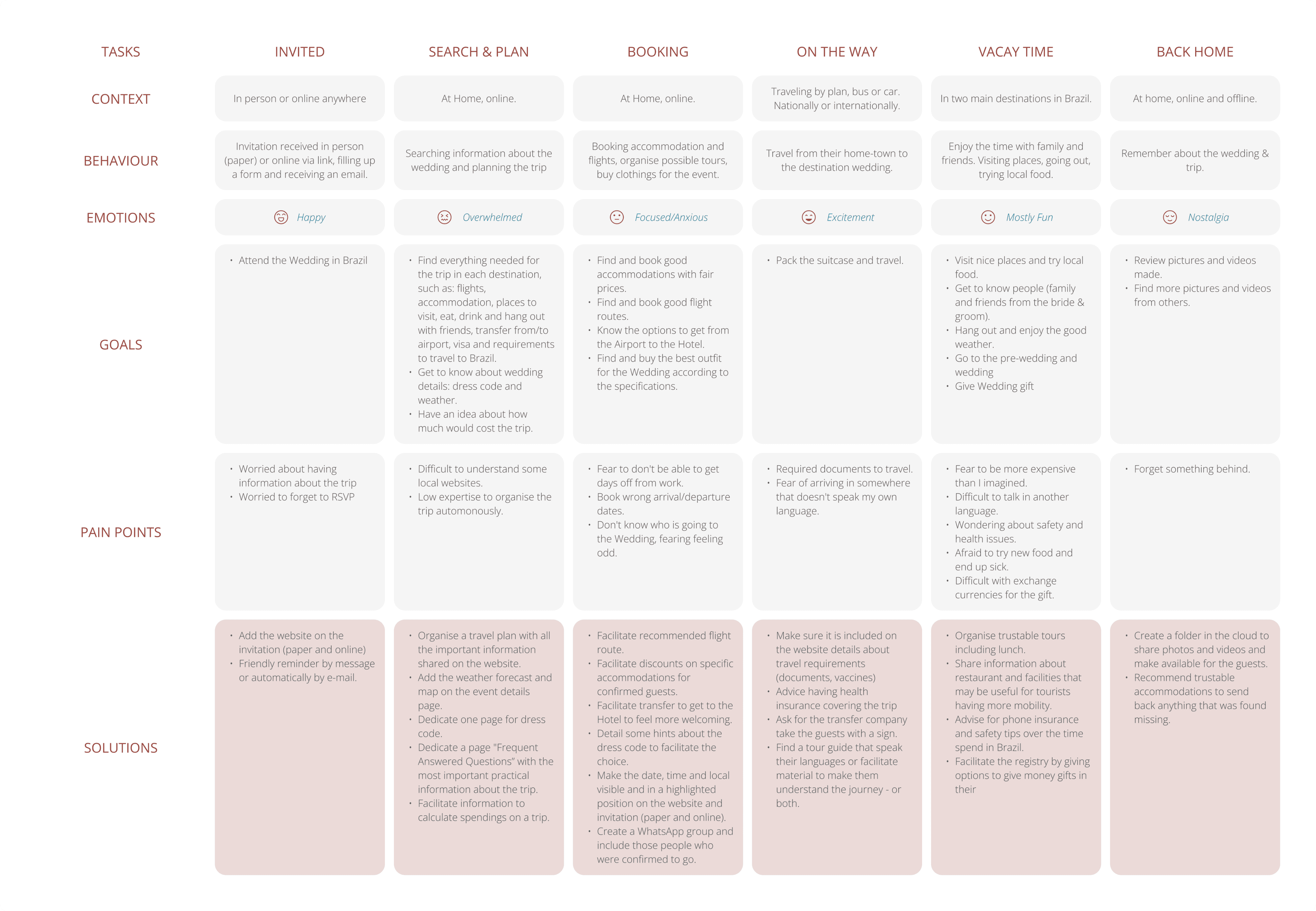
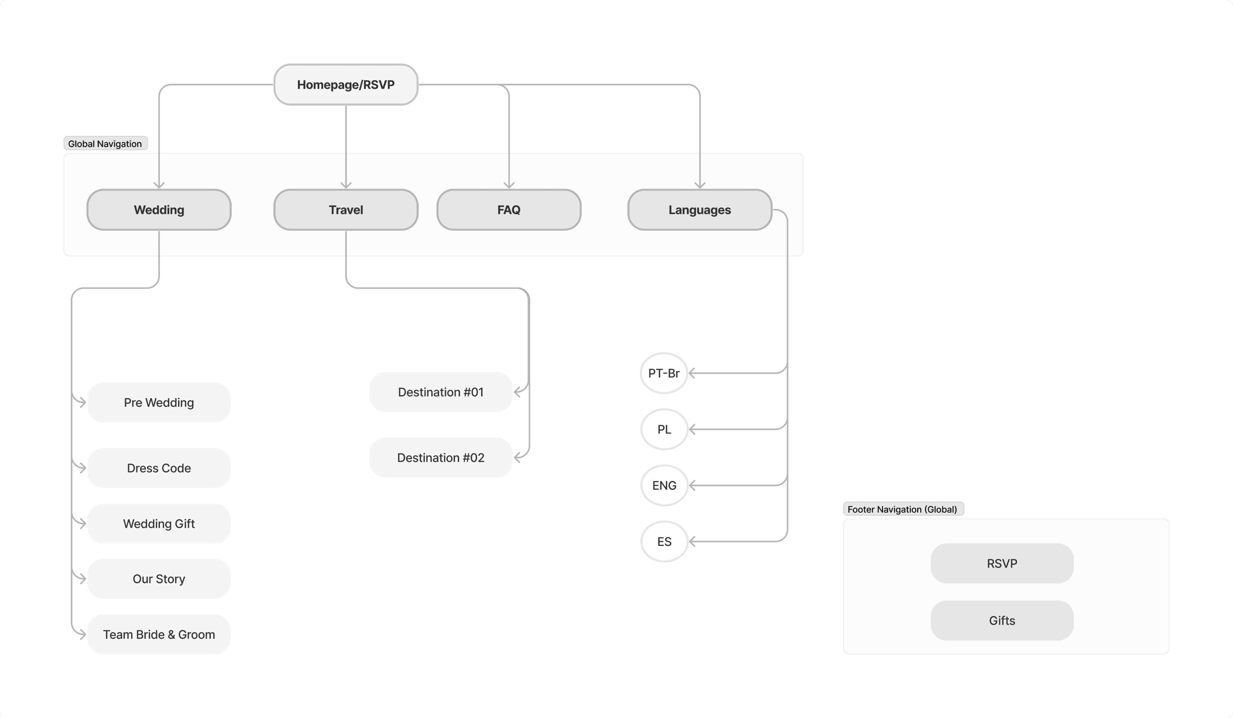
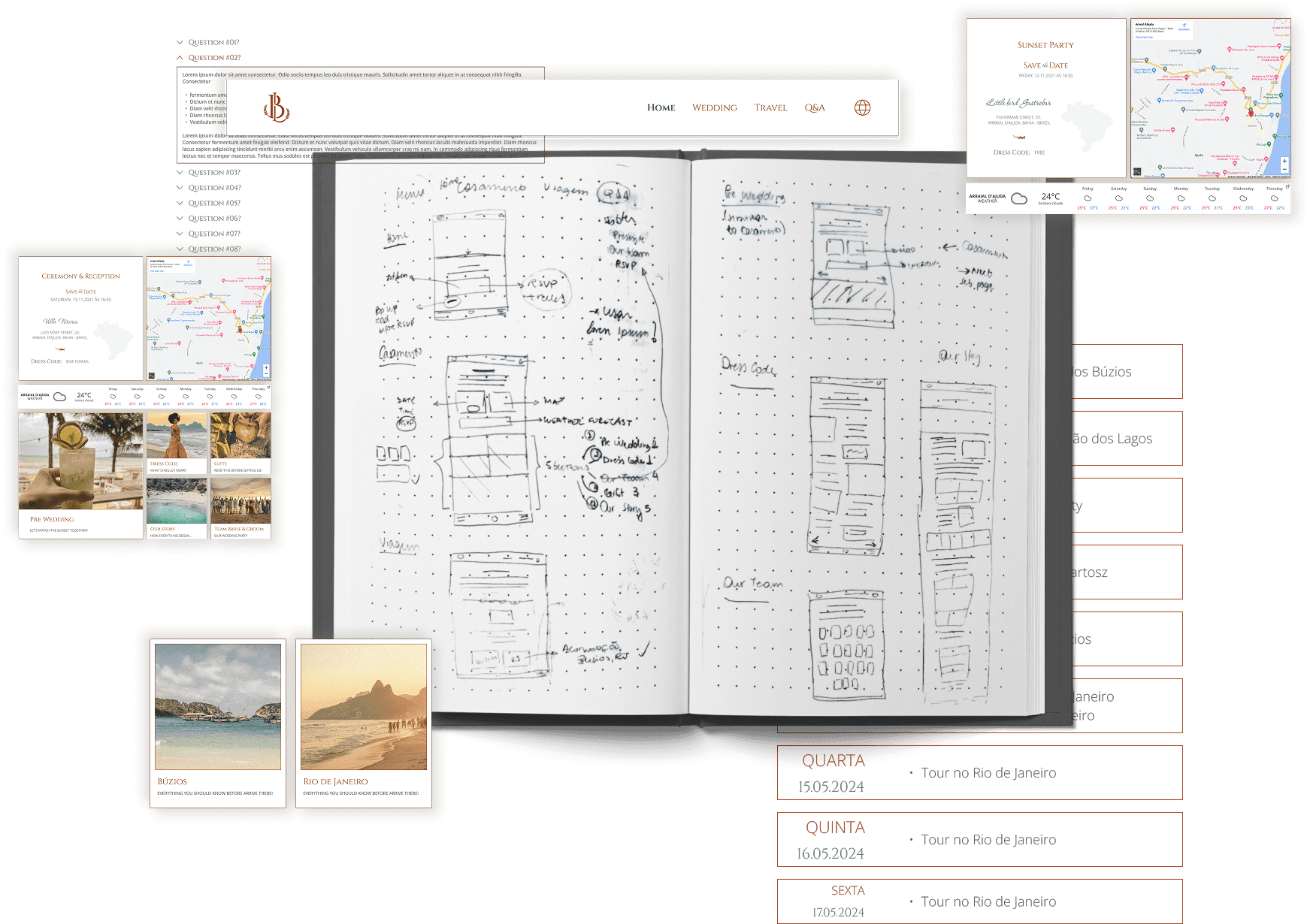
Mapping the wedding guest experience
International guests don’t just need a simple wedding website. They need a smooth, culturally aware journey from the invite to “It was remarkable your wedding” by checking the pictures after the event. So, I mapped out every key touchpoint to see where extra care was needed. The result became the backbone of an information system that tied it all together — with the website as the central hub.
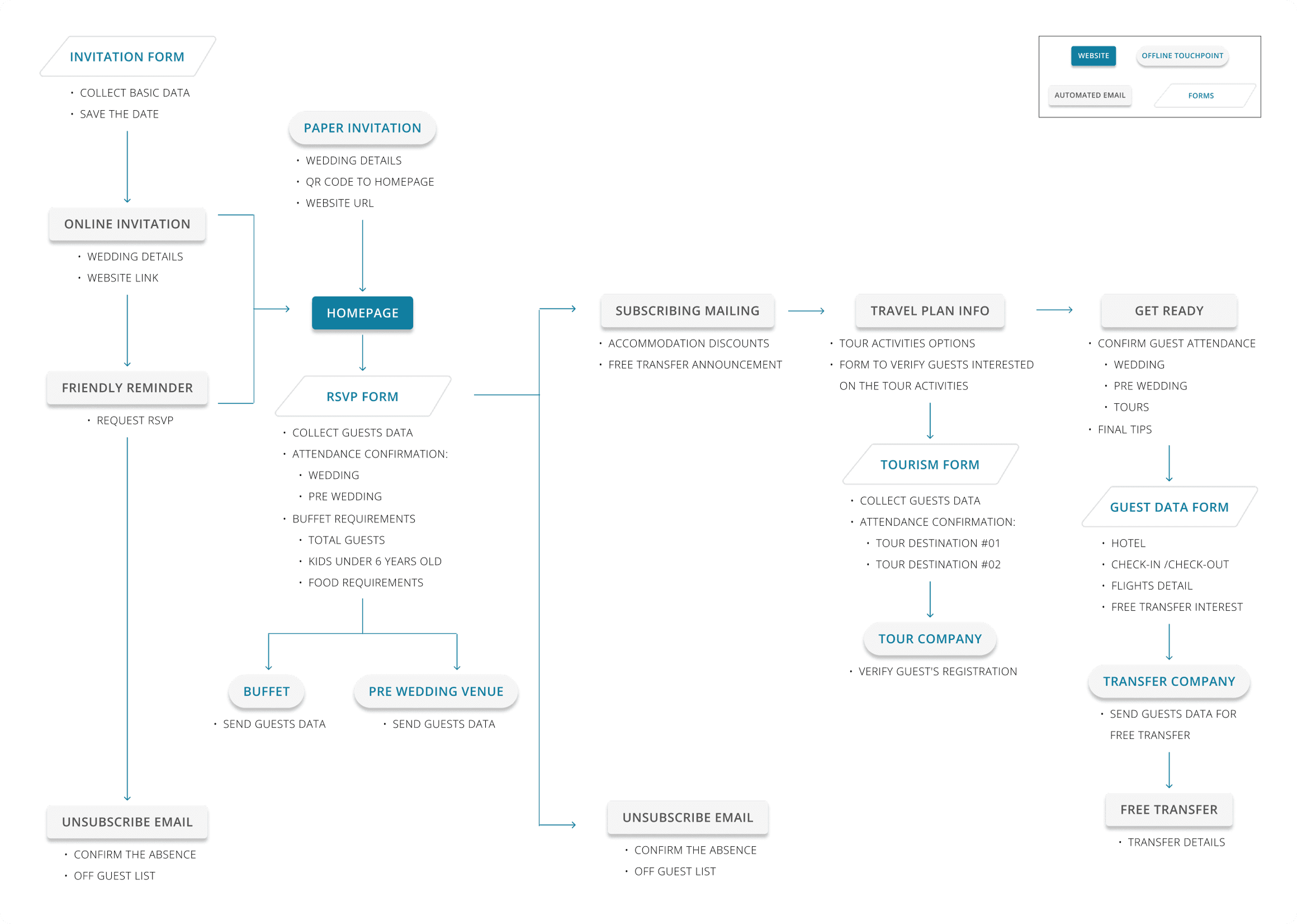
Designing the multi-management system
To keep both guests and suppliers on the same page, I mapped out exactly who needed what — from guest details for vendors to travel info for attendees. This visual system became my blueprint for managing the entire end-to-end experience, making a long-distance wedding feel a lot closer and easier to plan.
With the big picture in place, I mapped out the site to prioritise what guests needed most — from RSVPs and travel tips to gift details — keeping it simple, clear, and easy to navigate.
Aligning design with development for a faster launch
With a direct collaboration with developers we map their skills, constraints, and availability against the project’s needs.
So, together we set realistic goals, removing roadblocks, and agreeing on a plan that would keep the build smooth despite limited hours and no budget. These were some of the agreement:
Framework & hosting – Build in React for maintainability, deploy on Vercel for speed.
Structure – Modular component setup for easier maintenance and quicker iterations.
UI framework – Adapt MUI components to save time, customising only where needed.
Mobile-first approach – Prioritise 390px and 1024px breakpoints, skip tablet-specific layouts to focus on core devices.
Lightweight load – No skeleton screens needed; site loads quickly without them.
Simple, accessible assets – Use Google Fonts and Material Symbols for easy implementation.
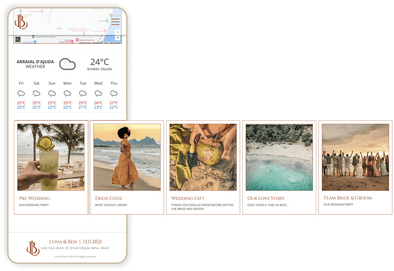
Engagement boosts – Embed Google Maps, Weather Widget, and YouTube videos to make the site more useful and dynamic for guests.
This alignment meant fewer back-and-forths, clear ownership of tasks, and a development process that stayed lean without sacrificing the experience.
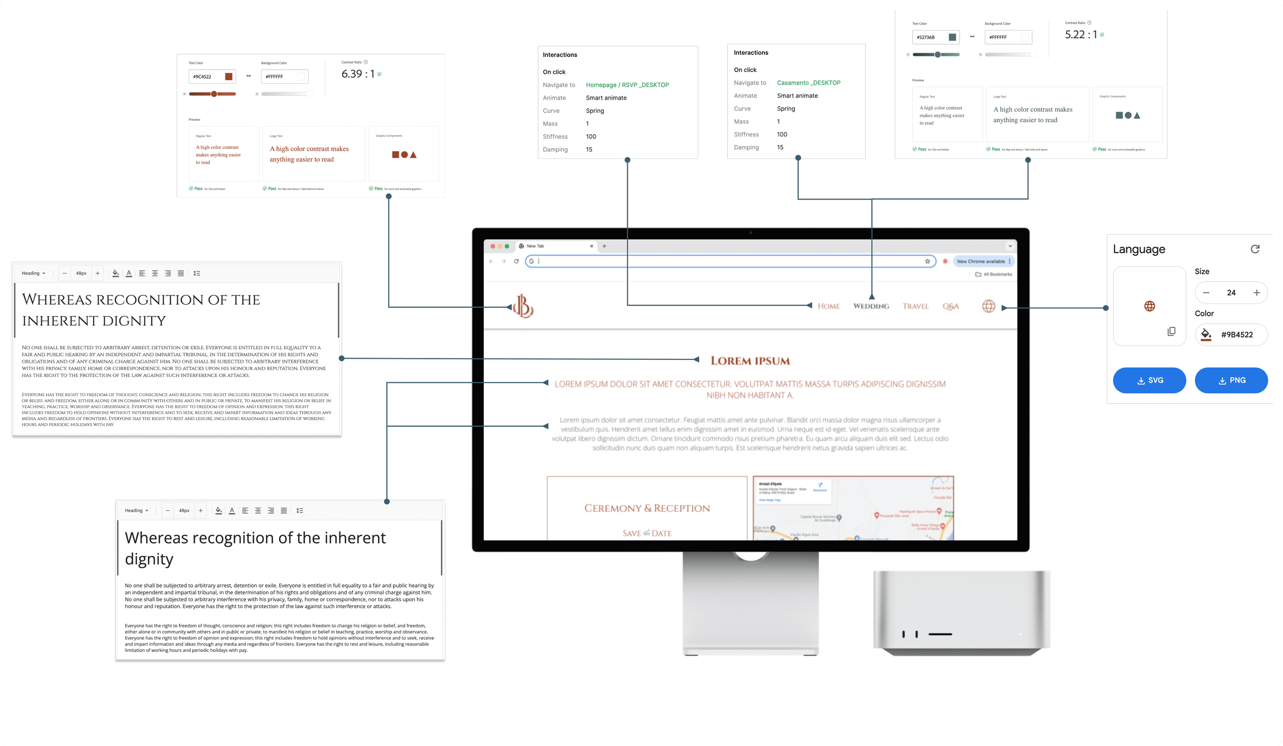
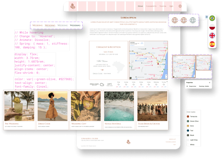
Bringing the brand to life
I teamed up with a graphic designer to craft a consistent visual identity — from the monogram to colours and typography that would work both online and offline. Later, I adapted the palette for better accessibility using Adobe Color, keeping contrast in check while allowing some flexibility for the audience’s needs.
Building with components in mind
Keeping it consistent, accessible and code-friendly.
I leaned on outlined stacks — some interactive, some static, some in carousels — so developers could easily replicate the code and keep the style consistent.
For content-heavy sections, I went with a blog-like layout, reusing the same text structure to speed up styling and make pages feel familiar.
And for info that didn’t need to be in-your-face, like FAQs, I used accordions at key points to keep things clean but still easy to find.
I kept usability front and centre, designing with the thumb zone in mind for easy mobile navigation and using grids to keep screens tidy, clear, and effortless to browse.
Making it developer-friendly
I kept the design as easy as possible to implement with the available resources:
wireframes with comments, prototypes showing key interactions, and
a detailed Google Doc with rules, extra info, and translations in Portuguese, Polish, English, and Spanish.
All photos and illustrations were neatly stored in Google Drive, ready for devs to grab and go.
Curious to see it in action?
Go ahead, click through — no RSVP required!
When an idea meets the MVP
Design dreams vs. dev reality
My idea for a playful slider with stop points turned out to be tricky to build and ate into our already limited hours.
We swapped it for a simpler, familiar stack-and-modal setup to keep deadlines on track.
Forms that didn’t quite fit
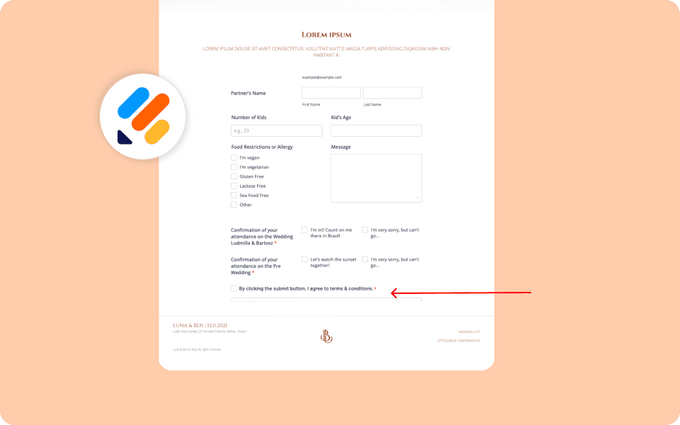
Using JotForm with LiteMessage streamlined guest management, the styling was clunky, some users missed the submission feedback, and Safari users occasionally couldn’t see the “submit” button.
A few post-launch fixes solved the worst of it.
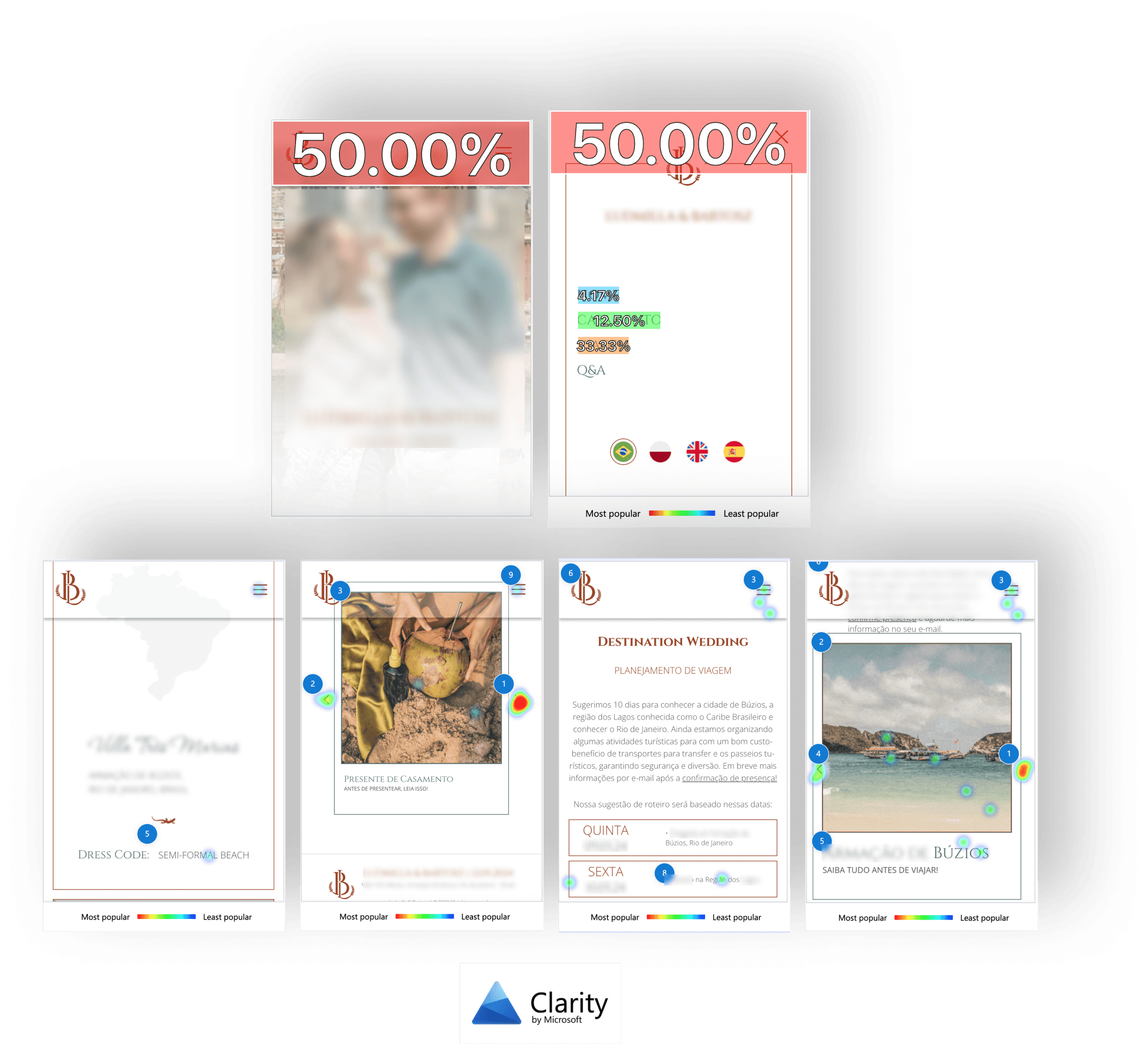
When “clickable” isn’t clickable
Outlined stacks without interaction looked too much like those with interaction, causing dead clicks on mobile.
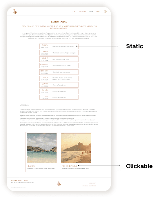
Priorities: Not critical for a temporary site, so we left it as is.
Minor rage clicks & tech quirks
Some menu-closing issues and odd horizontal scrolling popped up in recordings.
Logged and handed over to devs for fixes.
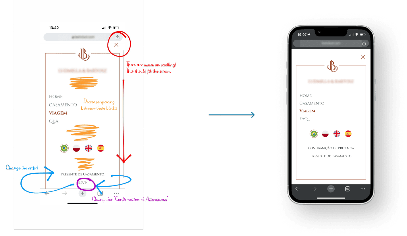
Lost in Translation & RSVP hidden
“Q&A” became “FAQ” for Brazilian guests, and “RSVP” became “Confirm attendance” for a better understanding.
Vertical menu scrolling buried the RSVP link. We tightened content spacing and tweaked link placement for better visibility.
Carousel fatigue
Dress code content was buried in the mobile carousel and there was demand for this information, so we bumped it to the second position and left less critical info for later.
Desktop was also changed to its grid layout for better visibility on the viewport.
Wrapping it up:
happy guests and proud devs!
Guest feedback was glowing — the site looked great, was easy to use, and answered most questions before they were even asked.
Polish guests adopted it surprisingly well, Brazilians… skimmed a bit more due to content strategy issues (too much reading).
International guests still had some travel queries, but design wasn’t the blocker.
For me, the real win was leading and collaborating with the devs. Staying empathetic, flexible, and ready to jump in when needed kept things moving — even when the senior dev had to cut hours near the end. We still launched on time, and the team finished proud of what we built together.

