

2.5 minutes
From clunky airline apps to a seamless booking experience

Ludmilla Ramos
|
Product Design
Project Overview
Competitor airline apps were slow, cluttered, and hid key booking details, frustrating users and wasting time.
ToucanFly’s redesign streamlined the journey, making it faster than competitors to book flights from the home screen, while improving clarity, accessibility, and user confidence, increasing the potential for conversion.


ToucanFly
|
2024
Impact
→ Up to 40× faster bookings than competitors
Streamlined flows and prioritised booking actions drastically reduced time-to-book.
→ Up to 60% reduction in booking journey steps
Optimising user flows and reducing data entry built trust, speeding up time-to-purchase.
→ Accessible for international travellers
Multi-language and multi-currency options ensured a smoother experience for a diverse, international audience.
Problem-Solving
0→1 | User-first Booking Flight Redesign
"Long waits and frequent page refreshes (very short downtime on these sites). Terrible. The amount of personal data requested for booking is immense. A login is mandatory, which always fails. An intermediate attempt was made on Skyscanner, which was unsuccessful. The site was extremely cluttered, and the display of proposed flights was bizarre, completely unacceptable."
Survey Participant
Key Problems:
Fragmented booking journeys → long waits and broken flows
Cluttered, inefficient screens → key actions hidden in noise
Limited transparency and control → forced logins, too much personal data
Goals
Booking made effortless, more buy-ins!
Key issues seen on Survey were analysed through an extensive Competitive Benchmark with an Heuristics Evaluation. ToucanFly would set a new benchmark for airline app usability by making the booking process faster, clearer, and giving more users control.
If the goal was to stand out in a competitive travel market, I had to design for desirability, not just viability.
So, my objective became to make this process with more potential buy-ins by making it easier and delightful for users to book a flight through the app and increasing flight booking conversion.
Challenges & Constraints
Limited research pool: Insights came from a small survey group and usability tests, so the data wasn’t fully representative.
Big scope, solo delivery: Tackled multiple problems at once to create a minimum desirable product, which meant more complexity for one person to manage.
Heavy high-fidelity prototype: Complex conditional variables in Figma prototyping slowed the process and extended timelines.
Prioritising UX over UI: Skipped branding colours and colour-contrast checks to deliver faster, as the focus was on UX and interaction, not on UI.
Hypothetical setup: No real client or budget; this was part of my Professional Diploma in UX Design.
The Process
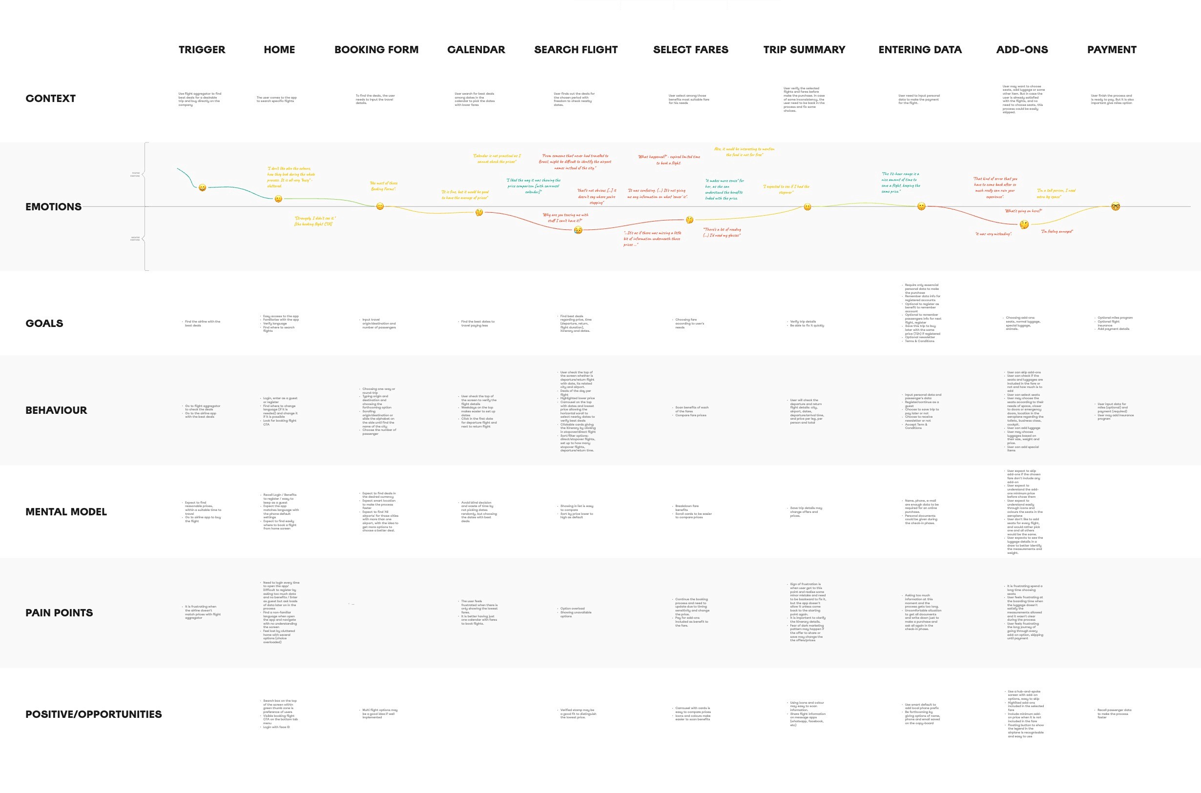
Spotting the cracks in the booking journey
80% of the respondents from the last 6 months went there to check prices.
Only 60% actually booked a flight through them.
But, why is there a 20% difference between those who just check and actually buy online?
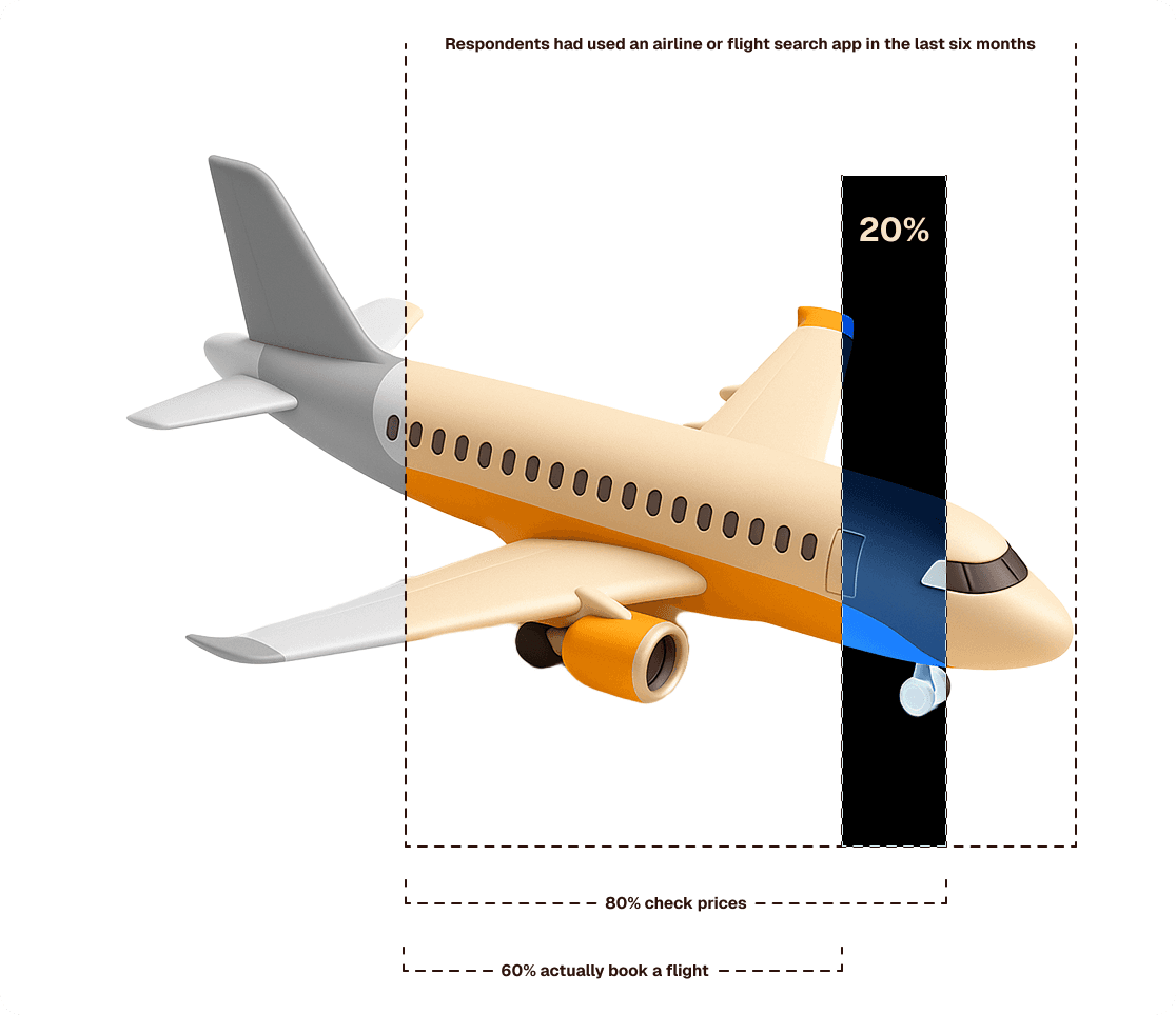
Competitive usability tests and heuristic evaluation demonstrated:
price came first,
screens were cluttered,
flows were slow, and
too much data entry killed the momentum.
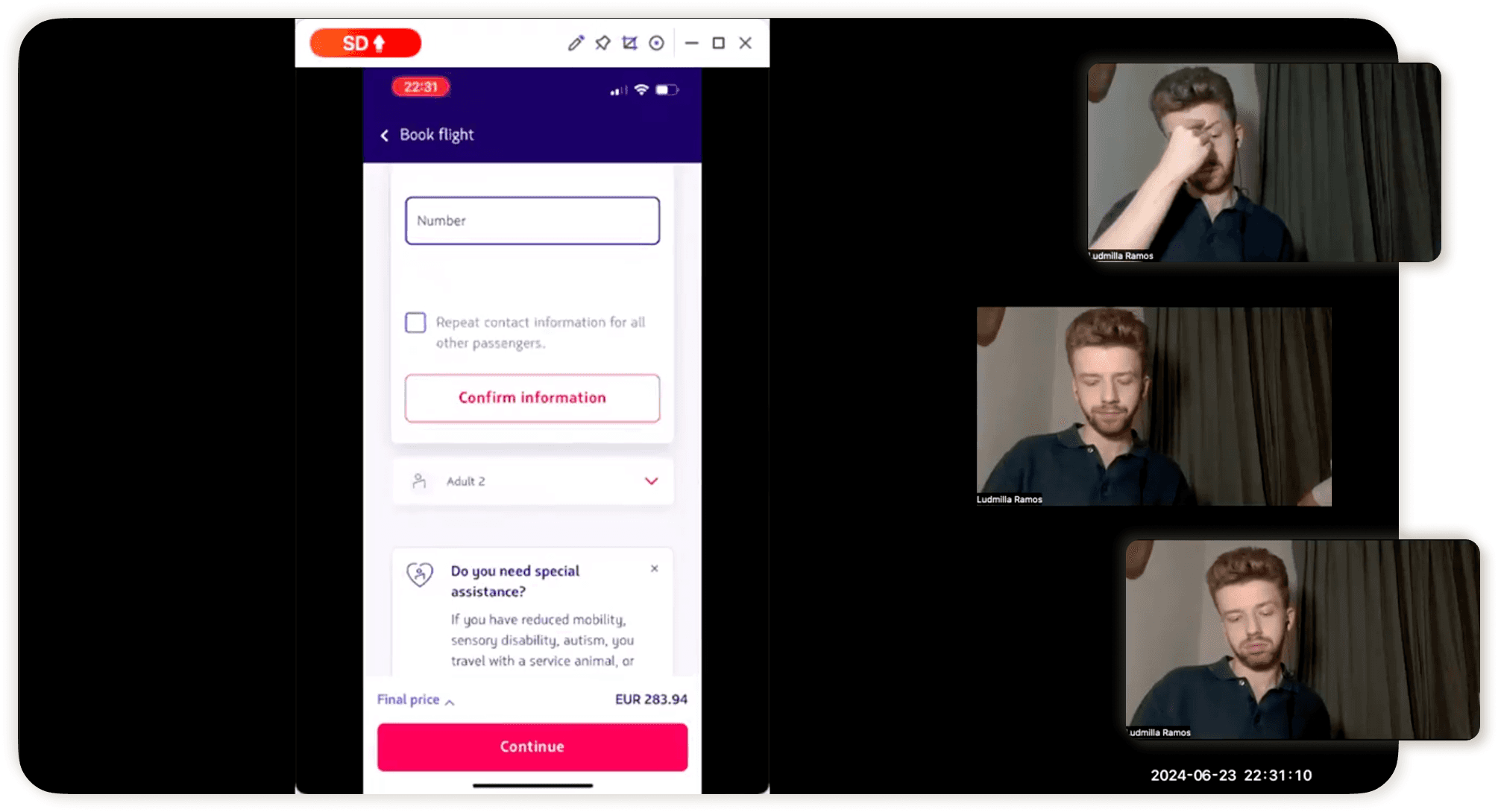
One tester summed it up perfectly:
"That kind of error that you have to come back after so much, really can ruin your experience".
Usability Test Participant
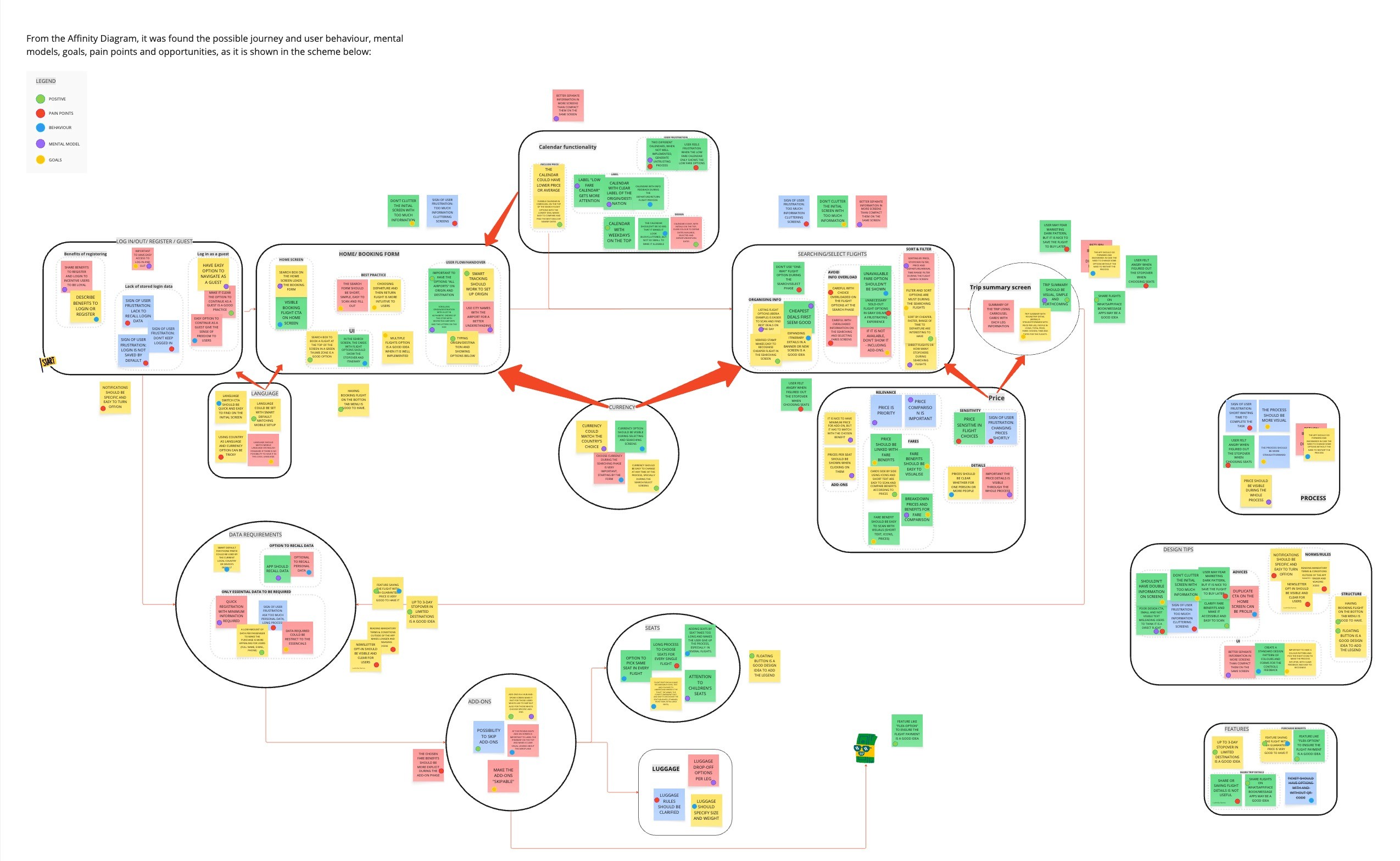
From these insights, I identified 11 key issues affecting conversion, trust, and overall experience spread across multiple touch points in the user journey, that were related to these 3 key problems found.
Shaping the first flight path
Making booking fast, transparent, and effortless, with flexible access, smart calendars, clear pricing, and minimal friction from the architecture:
Core questions to be answered at this stage:
Which components will best deliver the intended experience on each screen?
What choices should be prioritised in each frame to reduce cognitive overload?
How can I make the flow as accessible as possible for international travellers?
How can I ensure the process feels clear, transparent, and straightforward from start to finish?
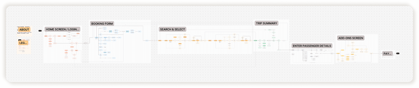
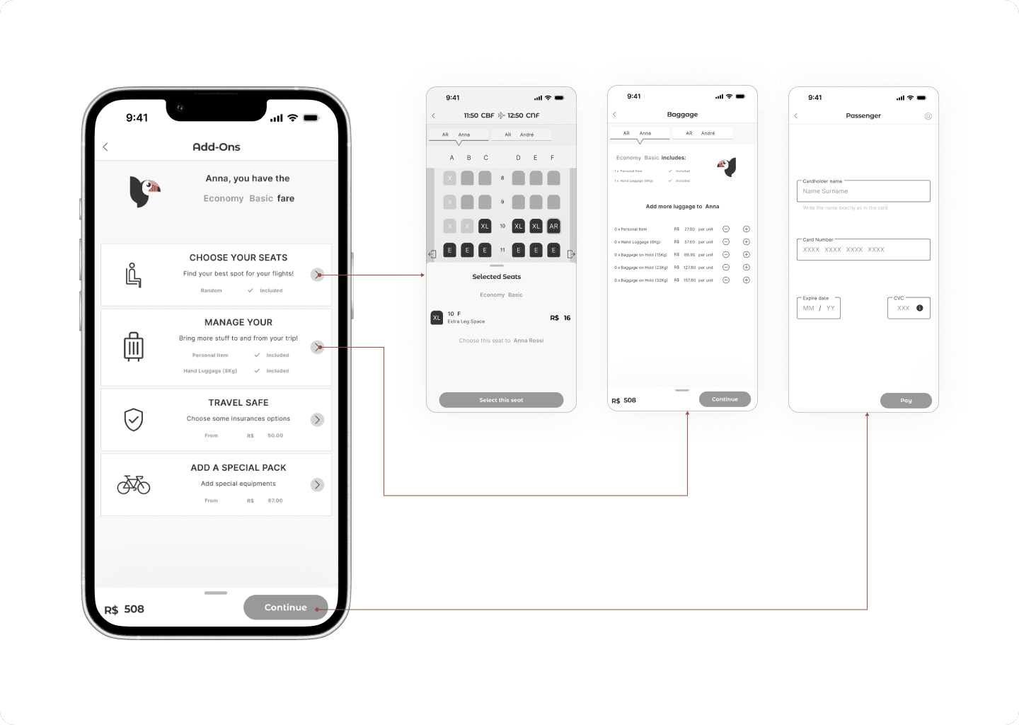
Designing the seamless end-to-end experience
As Toucanfly was a brand new product, I took inspiration from iOS, Material Design, and Orbit UI Kits, but every component was either heavily tweaked or rebuilt entirely in Figma to fit the product’s vision.
This process prioritised:
Accessibility: Accessible and purposeful components that would be intuitive for a global audience.
System thinking: Consistent, scalable asset library with +270 assets organised with variables, styles, and components that kept hierarchy intact and made future scaling effortless.
Collaboration: High-fidelity wireframes that work, including 71 wireframes crafted with atomic design thinking, ensuring everything behaved exactly as intended in prototyping.
If you’re curious about the UI Solutions that came out of this process, you can explore the full case study here.
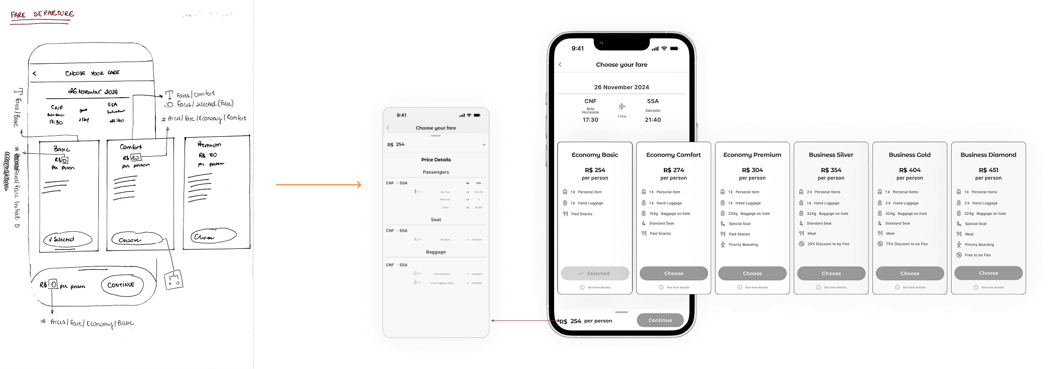
Prototyping to win approval
Prototypes help secure buy-in and show the real potential of an idea, and they are a great tool for improving cross-functional communication during implementation. While this level of detail can be time-consuming and often outside the budget and schedule, I went all in for the sake of learning. Using variables and conditionals in Figma, I recreated realistic interactions to make ToucanFly feel as close to the final product as possible — with no AI.

→ Try the prototype in Figma following the instructions
The final result
ToucanFly was my opportunity to design a minimum desirable product (MDP) that balanced user needs with a strong business perspective, without worrying about relevant contraints. I intentionally used the home screen to guide attention, created an intuitive flow that let users skip unnecessary steps, and incorporated purposeful engagement points — all without disrupting the rhythm or enjoyment of the booking experience.
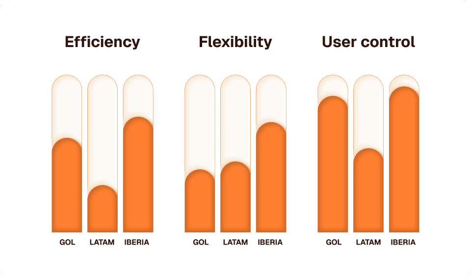
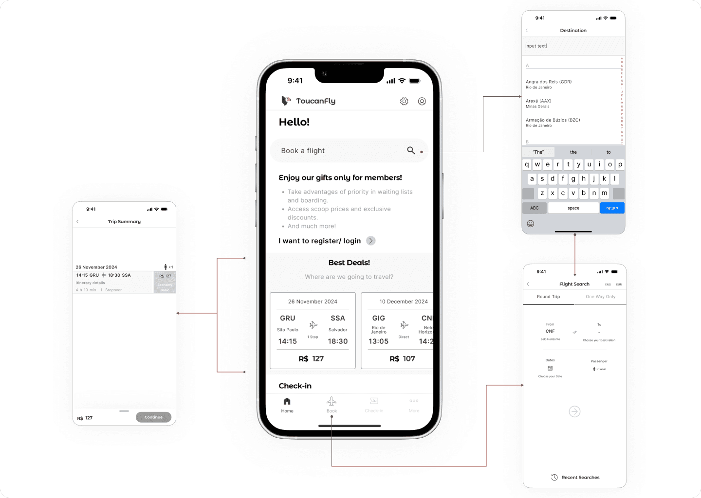
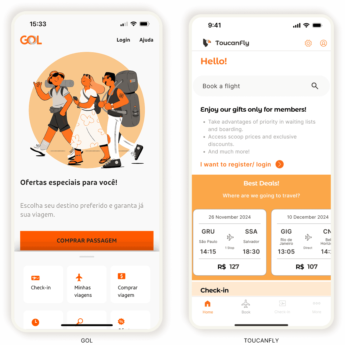
Solution #01: Optimising the Home Screen
4× faster than Gol — Gol Airlines leaves 52% of its home screen empty.
ToucanFly uses 43.8% of its home screen for three booking entry points —Search Bar (9.1%), Best Deals Carousel (33%), and Menu Option (1.5%), increasing potential for conversion.
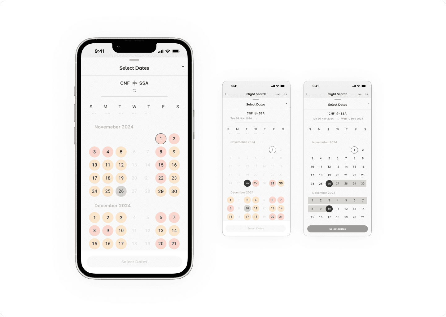
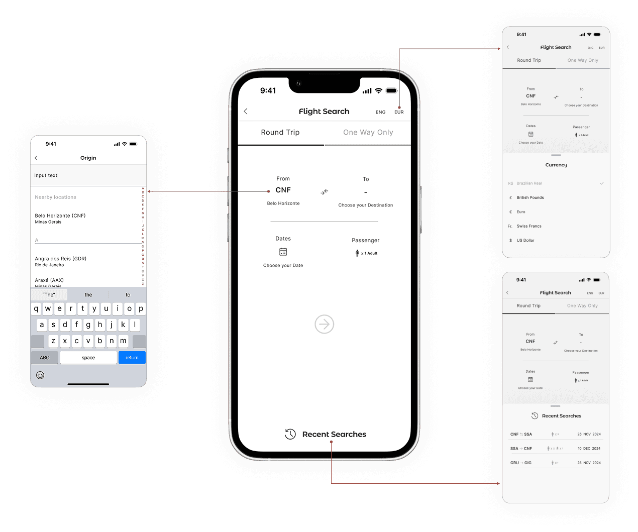
Solution #02: Optimising the User Flow
40× faster than Latam – Latam’s booking journey is long and rigid.
ToucanFly’s Search Bar lets users skip one step, while the Best Deals Carousel cuts up to 60% of the booking process, cutting off unnecessary data at this stage — significantly reducing time-to-purchase and encouraging users to make a quicker decision.
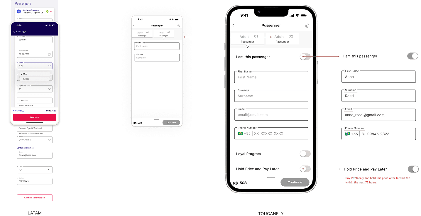
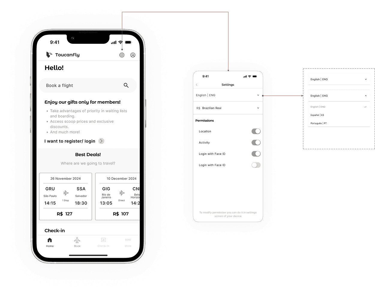
Solution #03: Foreigners' friendly
ToucanFly implemented two key fixes: a simple and intuitive way to switch languages using global icons, and flexible currency options upfront. This reduced late-journey frustration in the booking flow, making the experience more accessible for international users.
Final takeaways
The booking journey became faster and more transparent, increasing the likelihood of conversion.
Clearer pricing and flexible flows helped build user trust, improving retention potential.
Prioritising high-impact features on the home screen creating multiple pathways to purchase, optimising engagement and reducing drop-offs, can declutter screen and shorter journeys.
Collaboration is more efficient when there are real interaction among teams than creating a high-fidelity prototype, and nowadays with Figma Make and other AI tools could present similar idea and concepts to speed up the process.
Prioritise problems doesn't mean select some to solve and ignore others, but identify issues that help solve the problems and reach the business goals, keeping the product integrity.

“So really nice work. I think you've got a solid understanding of the core user flow and the process was quite easy to follow and it was pretty intuitive. It guided me nicely along the way. So really great work.”
UX Design Institute Student Success Team
Project Review

