

1.5 minutes
Designing a high-performance booking interface

Ludmilla Ramos
|
UX/UI Designer
Project Overview
ToucanFly’s UI was designed to maximise clarity, reduce decision time, and build trust through visual consistency and interaction design. Each component was crafted in Figma using atomic design principles, inspired by iOS, Material Design, and Orbit UI Kits to accelerate implementation, but adapted or rebuilt to fit the product vision.


ToucanFly
|
2024
Impact
→ 43.8% of the home screen focused on booking — nearly half the entry point dedicated to the primary task, reducing friction and speeding up time-to-book.
→ +270 scalable UI assets delivered — a reusable component library based on iOS, Material Design, and Orbit UI Kits, cutting design/development time for future features.
→ Conversion drivers embedded in the flow — loyalty sign-ups, upsells, and transparent pricing integrated seamlessly, boosting user trust and encouraging faster booking decisions.
Problem-Solving
Although ToucanFly was a UX-focused project, UI played a pivotal role in shaping outcomes. The choice of components, visual hierarchy, and layout clarity weren’t just aesthetic decisions. They directly influenced user trust, booking speed, and conversion potential.
Usability tests revealed: cluttered layouts, poor prioritisation, and interfaces that ignored accessibility were costing users time and confidence and cutting off buy-in.
"I'm done with it! I'm not interested in a change for a flight to Barcelona".
Usability Testing Participant
Key Problems:
Poor visual hierarchy: Key booking actions and information weren’t clearly prioritised, slowing decisions and increasing drop-offs.
Low scannability for high-volume data: Dense, unorganised layouts made comparing flights and fares more difficult than it should be.
Limited accessibility for global users: Hidden language/currency settings, rigid date tools, and unclear pricing eroded trust, especially for international travellers.
Goals
Designing a UI that delights users and the business
Design layouts and components that the whole booking journey could feel clear, consistent, and trustworthy.

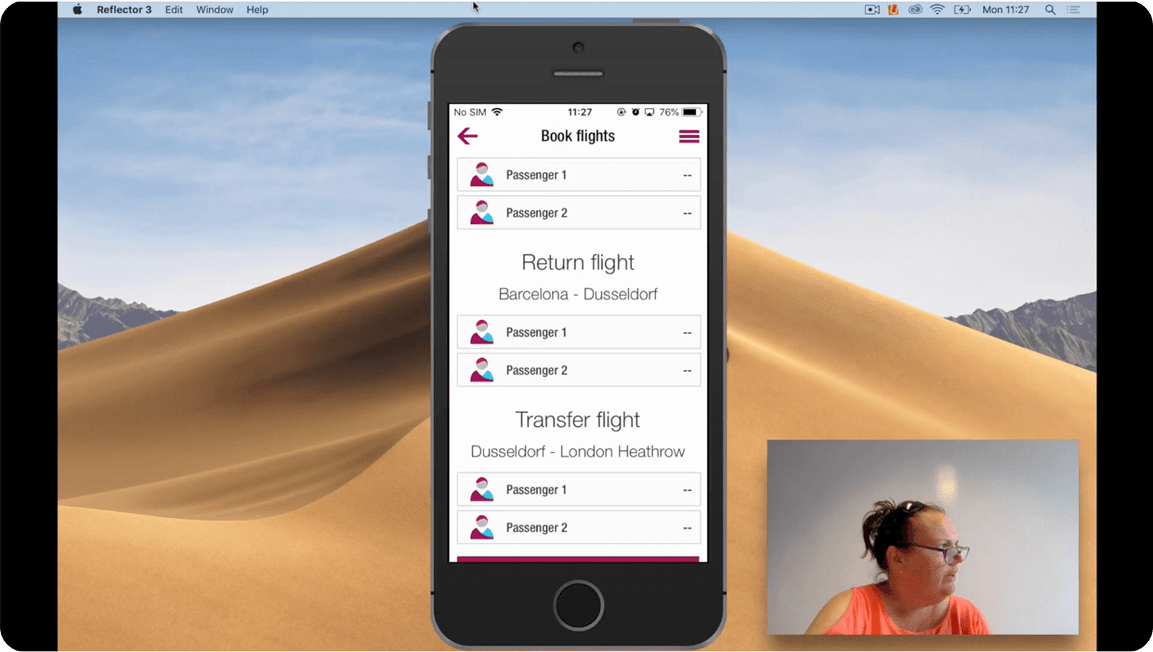
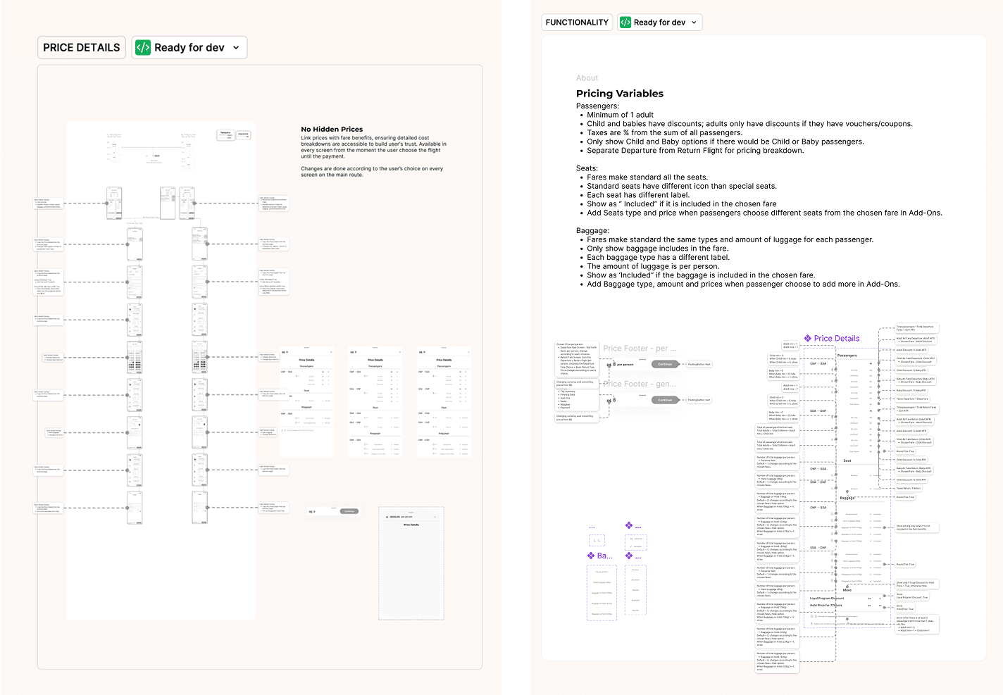
The high-fidelity Figma prototype wasn’t just for show, it made usability testing more realistic, with the intention to win stakeholder buy-in, and also giving developers a head start. So, it needed a system thinking using existing UI Kits to streamlined communication and decrease dev workload.
Challenges & Constraints
Design entirely from scratch: No branding or visual identity existed, so every component, style, and interaction had to be designed from the ground up in Figma.
Managing high design complexity by my own: 71 wireframes and +270 custom or modified assets had to follow a consistent visual hierarchy across the booking flows.
Presenting dense information with clarity: Flight booking requires a lot of data on screen; layouts needed to be scannable, intuitive, and easy to navigate.
Ensuring global accessibility: Interfaces had to work for international travellers with visible language/currency settings and universal icons.
Balancing clarity with conversion goals: The home screen needed to remain clean and intuitive while maximising booking opportunities without overcrowding.
The Process
1. From research frustrations to UI that works
People kept pointing out cluttered layouts, repetitive information, and way too much wording on the survey. When we ran usability tests, those pain points came through loud and clear, with users describing them as frustrating and time-consuming.
While the strategic UX process was built around the journey map, I also paid close attention to what was visually working (and what wasn’t). That meant making smart calls on which components to use and which ones to leave out to keep the experience clean, clear, and conversion-focused.
If you’re curious about the full UX strategy behind improving booking conversion in an airline app, you can check out the complete case study here. Here, I’m focusing on the UI choices that made a real difference to both the user experience and the business impact.
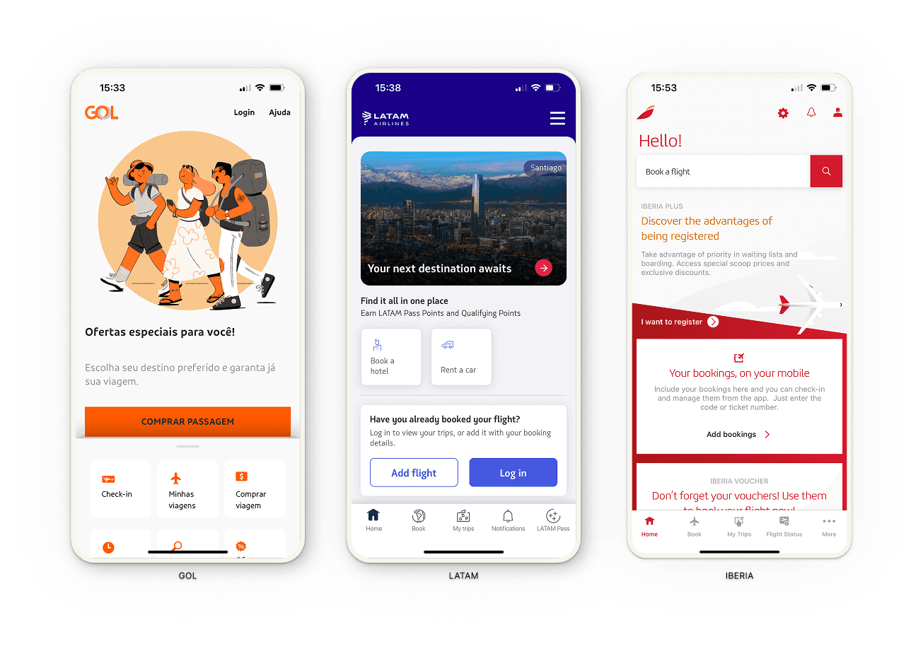
Spotting what works and what holds users back
Gol’s home screen missed key engagement opportunities, showing redundancy in calls-to-action.
Latam’s layout felt more like a static ad than an invitation to book.
Iberia stood out slightly, with a labelled search bar that users in testing were more likely to use — even if it wasn’t the most conventional approach.
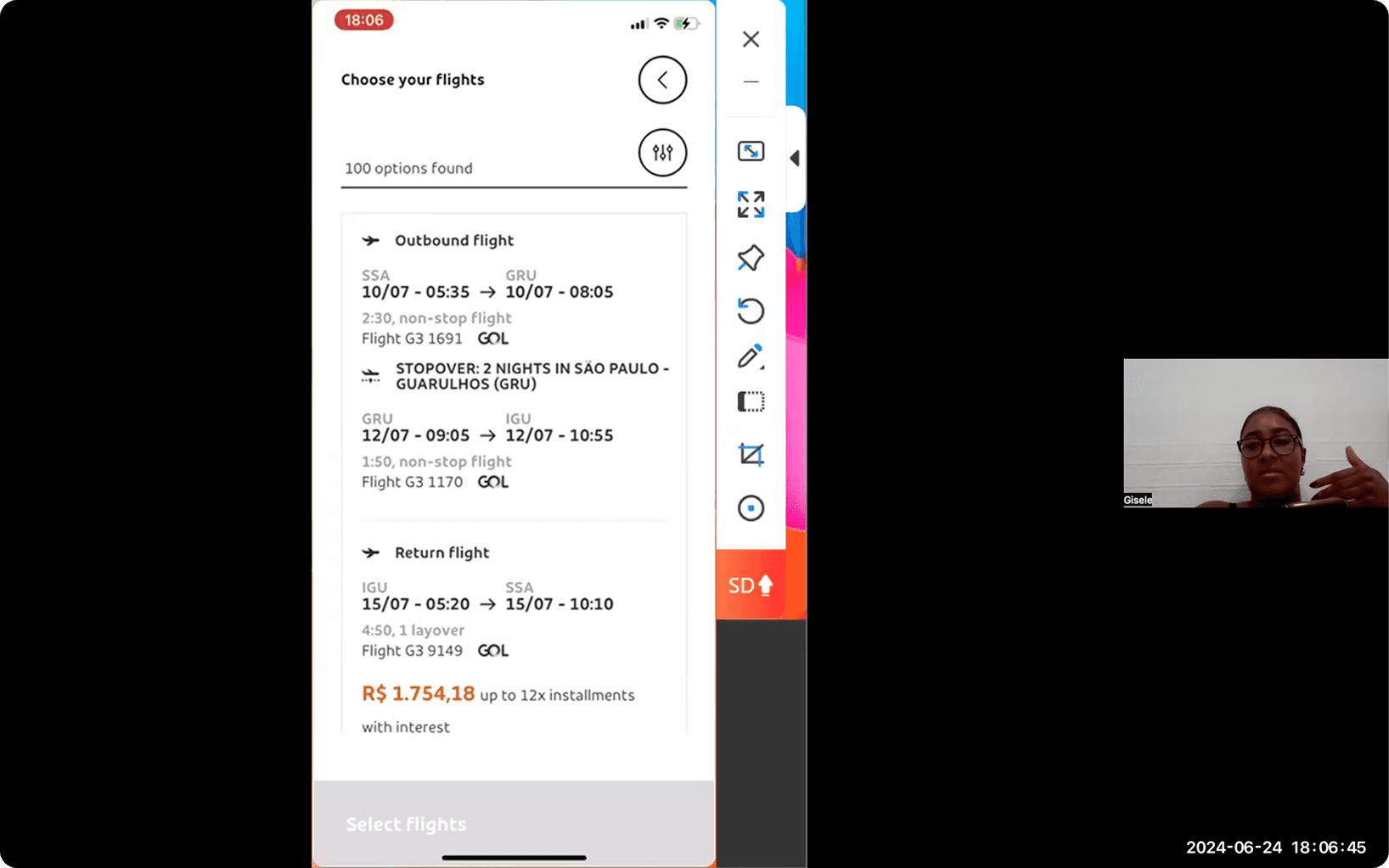
The usability tests told an even clearer story: Gol’s search results created cognitive overload with 100+ hard-to-scan options.
"There are several options, but the combinations don't change that much."
Usability Testing Participant
Iberia, on the other hand, broke the process into manageable steps, added date flexibility with a carousel, and kept entry data minimal on an optimised screen.
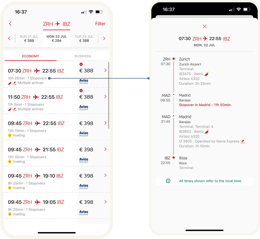
It was also the only one to speed up the add-ons stage, letting uninterested users skip entirely, while giving others quick, card-based options.
Building the pieces that bring the vision to life
I still needed a visual identity to make the experience feel real. To keep the focus away from colour accessibility at this stage, I worked mostly in grayscale — just 7 shades — plus red, green, and their variations for specific components and status indicators. Typography, grid, icons, and even a simple logo brought enough structure and character to make the prototype more "marketable".
But great UI is more than looks. I had to ask myself:
Does the layout simplify decision-making and shorten booking time?
Which components will create the smoothest journey and the best potential for conversion?
Does the visual hierarchy lead the user naturally to the primary action?
Are all screen transitions consistent with the action taken?
Will this be visually appealing yet still make sense for developers to build?
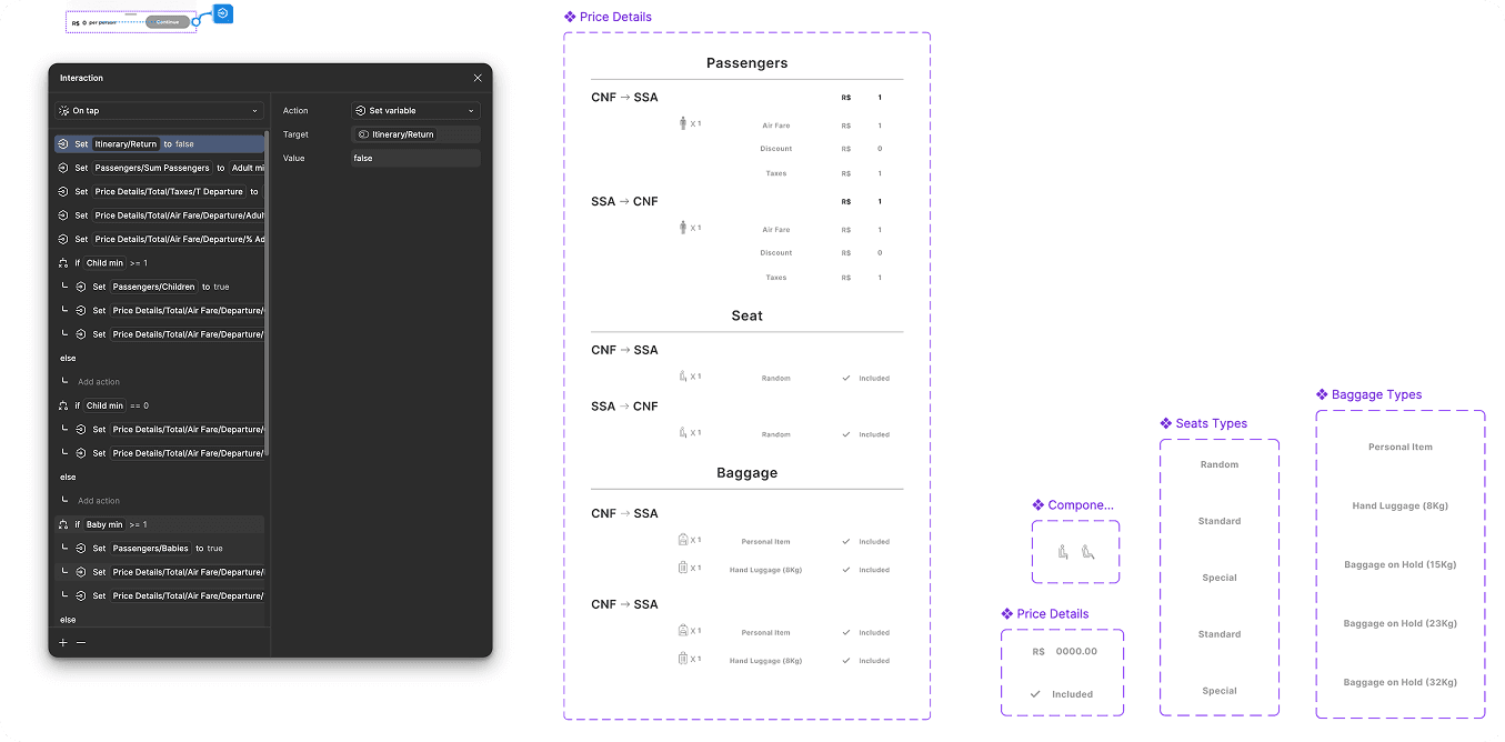
Are components built with the prototype in mind, using variants and conditionals to behave just right?
Are tap targets, spacing, and typography optimised for comfort and readability?
Curious about how all the pieces fit together?
You can explore the full set of wireframes and the 270+ custom assets I created for ToucanFly directly in Figma.
→ Check the wireframes and assets here
UI decisions that drive business impact
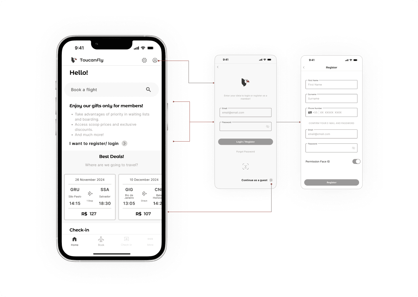
Flexible access from the start
Users can log in, sign up, or continue as guests in a single tap.
Loyalty perks are highlighted without adding friction.
A clean layout and a best-deals carousel streamline the flow by skipping extra screens, while strategically placed components nudge users toward faster booking decisions.
Smart Calendar
Colour-coded calendar with price cues
It shows the average fares based on booking in advance, giving users more control and building trust throughout the process.
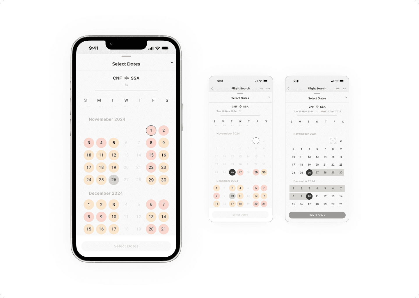
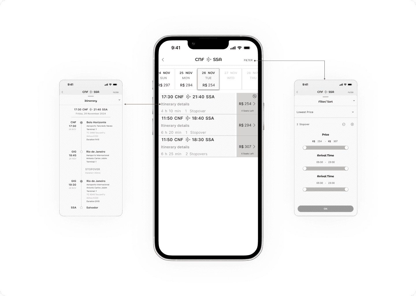
Scannable search
Scroll calendar with smart filters
Let users explore nearby dates, compare options in list view, and quickly spot the right flight without cognitive overload.
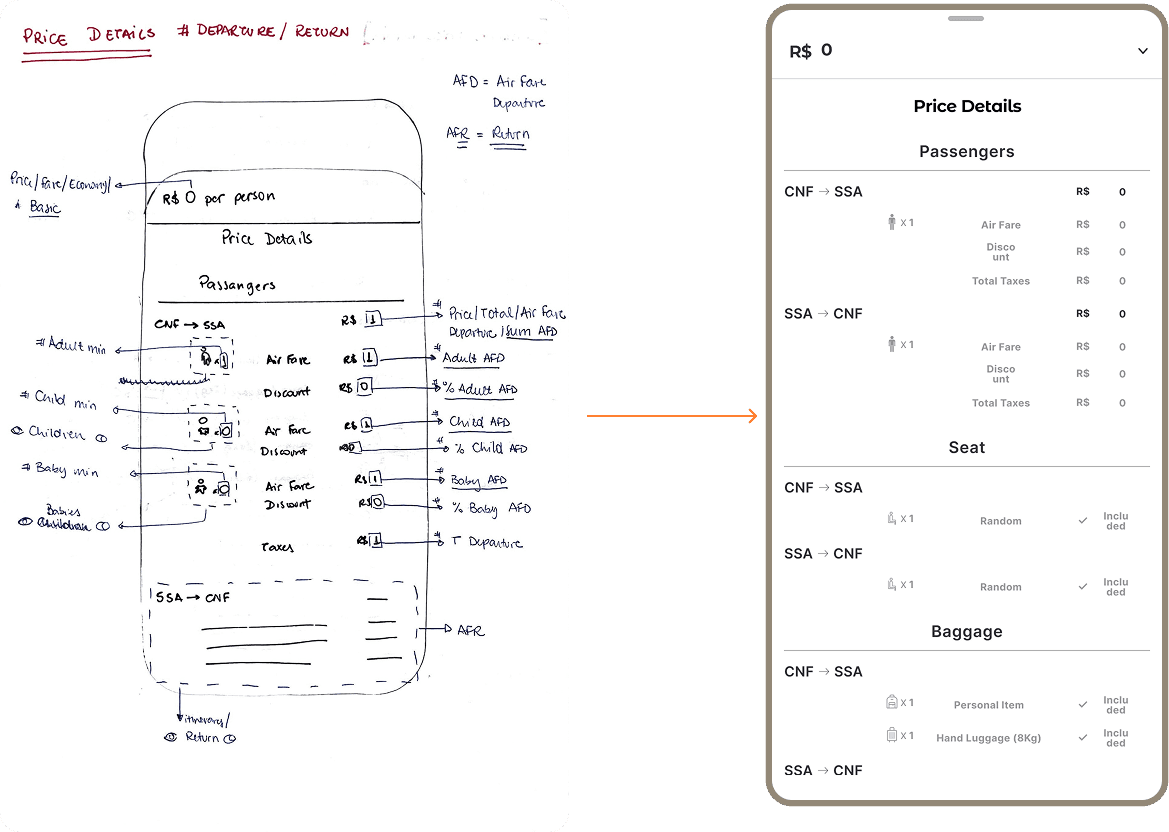
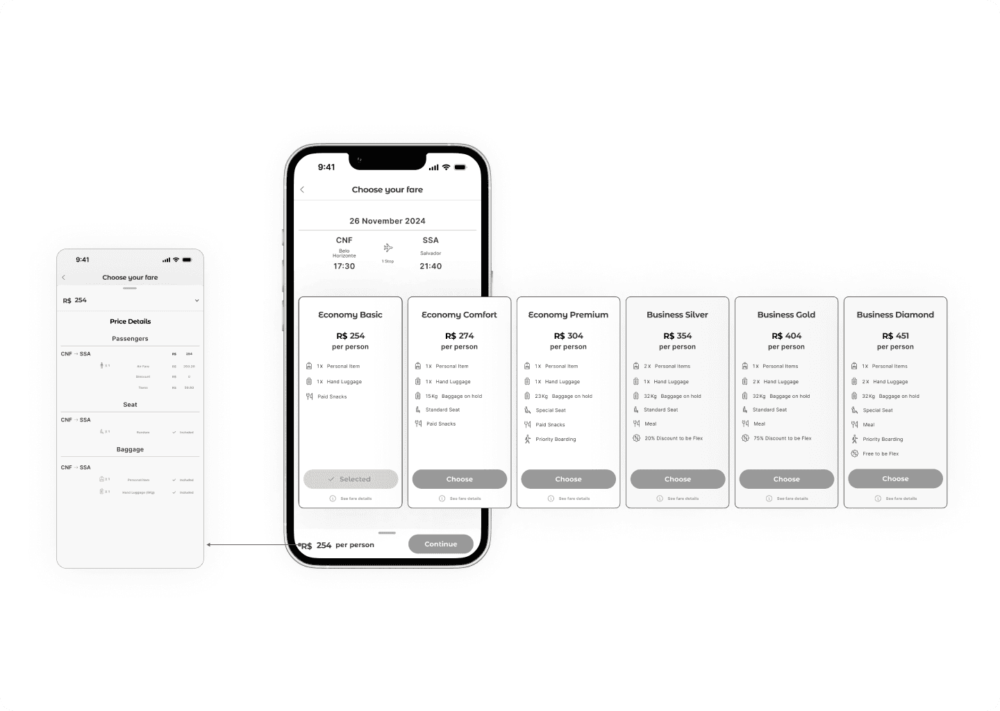
No hidden surprises
Transparent fare breakdowns linked to benefits make costs clear
Reducing drop-offs caused by unexpected fees.
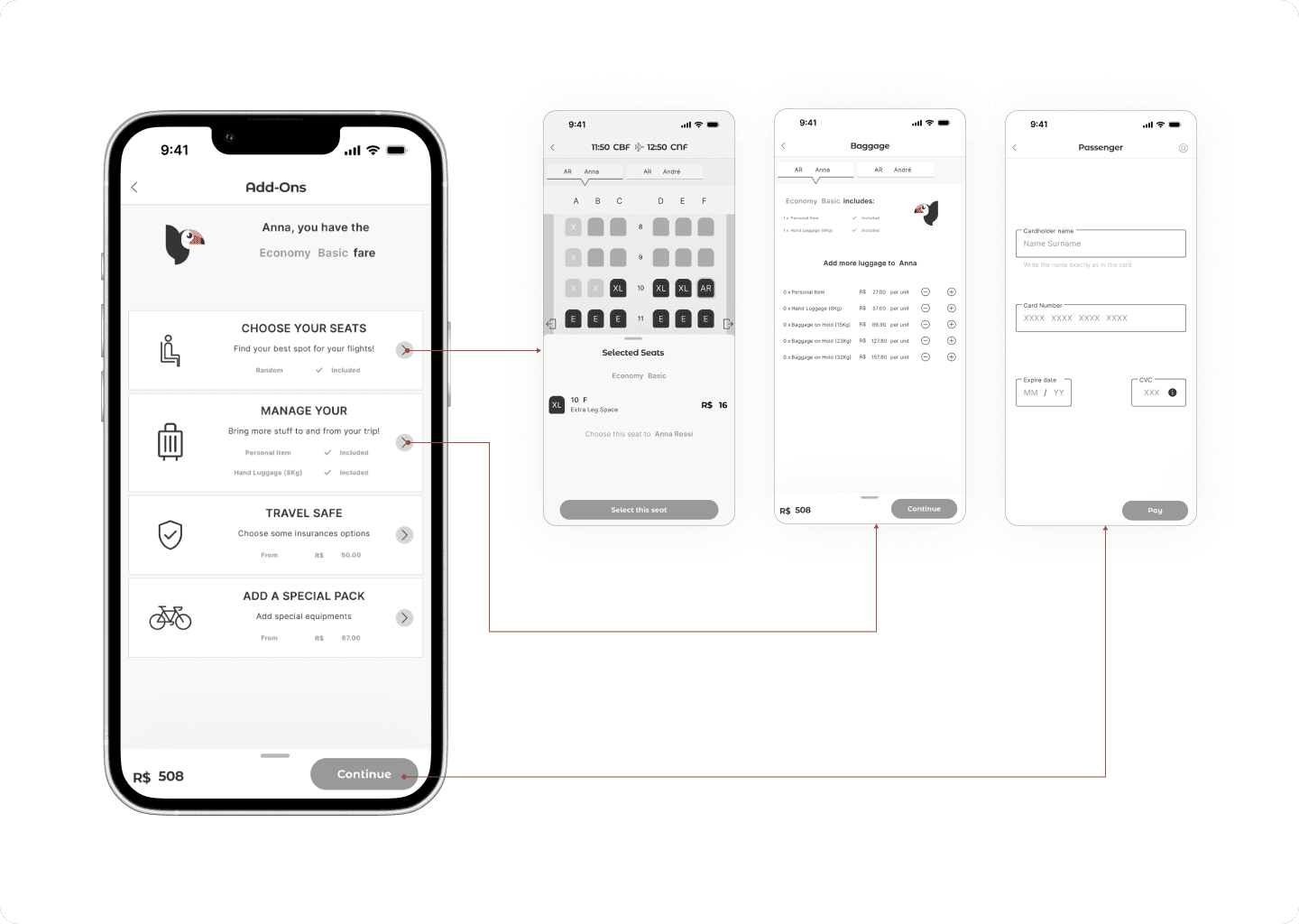
Add-ons on your terms
Optional extras like luggage or seat upgrades are easy to skip or select in just a couple of taps
Keeping the flow smooth.
Handover
I didn’t create a full Design System for ToucanFly — there was no need to, but I made sure nothing was left to chance. Every hierarchy concept, layout structure, piece of copy, and interaction rule was documented in an extensive annotation handover. It explained the “why” behind each design decision, detailed the conditionals, and outlined the style guide elements — all to keep the experience consistent and make usability seamless from design to implementation.
Final Takeaway
Competitive benchmarking helped identify which UI patterns drive action versus create friction.
Breaking complex processes into manageable steps reduced cognitive overload and sped up decisions.
Transparent pricing with visual cues built user trust and reduced booking abandonment.
Flexible journeys with skippable steps accommodated different user intents without adding friction.
Thorough design annotations ensured consistency from design to development, even without a full Design System.

